DESIGN NAME:
commod – Feines in Holz
PRIMARY FUNCTION:
Stationery
INSPIRATION:
„The Passion for detail represents the specific“. The company´s founder Stefan Freudenberger thinks, feels and lives this way. His view for the extraordinary is the basis for success of the accomplished master joiner: Freudenberger sees exception in simplicity – when it´s created with passion, enthusiasm and a sense of quality. Living this philisophy made the grounded handcraftsman the perfect source of inspiration for Lattke und Lattke: a strong character, honesty, uniqueness – just like interior made by commod. This is how the office equipment should be. Mission accomplished.
UNIQUE PROPERTIES / PROJECT DESCRIPTION:
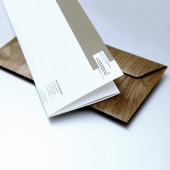
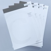
„commod“ is specialised in interior work. True to the motto “fine wooden commodities” the company realises especially highly exclusive residential projects. The stationery was to meet this claim. A reduced but playful layout has been realised using especially blended colour. The stationery reflects the firm’s style as well as its ideology to use only the most precious material: The paper is made of 100 percent cotton, the envelopes of real wooden veneer. The business cards “embody” the companies’ slogan by creating a 3-dimensional room containing typical wooden products.
OPERATION / FLOW / INTERACTION:
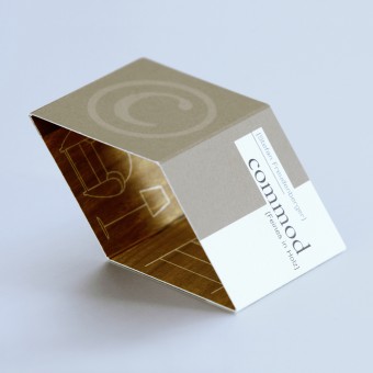
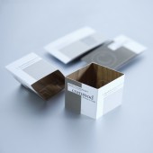
3D-business card: Whoever gets to touch this communicative device can feel the slightly rough haptics and is being invented by it´s centered fold to form the assumingly even card to a cube. Doing that forms an object that style-conscious clients love to have on their desktop. The innerside picks wooden grain up and demonstrates commod´s closeness to nature. Typically interior fittings are pictured in addition. Those pictures have the effect of a showcase – and send a pulse tot the observer: „We can design this and more also for your home. commod.“
PROJECT DURATION AND LOCATION:
The project started in March 2011 in Reichenberg (Bavaria) and finished in May 2011 in Reichenberg.
FITS BEST INTO CATEGORY:
Graphics, Illustration and Visual Communication Design
|
PRODUCTION / REALIZATION TECHNOLOGY:
Stationery is made from 100 percent cotton. This unusual source material gives rough surface feel and a higher value. The back of the letter point the naturalness of commod’s products with an elegant wooden finish. In contrast to stationery the envelope shows its secret: Made of wood veneer with a plastically touch. Rounding out the office equipment by a foldable business card.
SPECIFICATIONS / TECHNICAL PROPERTIES:
Stationery: 210x297 mm,
Business Card: 91x50 mm,
Envelope: 230x115 mm
TAGS:
Letterhead, Envelope, Business Card, Stationery
RESEARCH ABSTRACT:
Quality custom materials play a major role for commod. Basis is always the wooden construction: a natural grown material with its own unique character. Its grain is as unique as a fingerprint. At the same time a tree shows all the naturalness and high precision and stability: Every little ramification must be supplied with water. The office equipment carries these apparent contradictions with in: stationery with individual character of cotton, envelopes with playful wooden-look, precise and clear typography design. Complemented by the modern functionality of the business card.
CHALLENGE:
How can somebody transport a man´s passion? How do you convey a passion for detail? How do you symbolize happiness on hidden particularity? Questions that Lattke und Lattke had to face inevitably implementing the ideas for Stefan Freudenberger and commod. Casual products did not come into consideration for the office equipment. So much better was the solution: the envelopes in a real wooden appearance come up all around remarkably, the cotton paper surprises not before the second touch with an uncommon haptics. Commod´s passion lies in details, in charateristics. And by the help of Lattke und Lattke even in his office equipment.
ADDED DATE:
2012-02-22 07:55:35
TEAM MEMBERS (2) :
Jens Lattke, and Kerstin Hlava-Landeck
IMAGE CREDITS:
Jens Lattke, 2011.
|
