DESIGN NAME:
Xmatrix Quadrus
PRIMARY FUNCTION:
Labyrinth Puzzle
INSPIRATION:
Influences include puzzles and games I played with as a child, as well as a graphic interest in pattern and illusion. I wanted to design a serious self-contained challenge that you could look at again and again. It had to be simple to understand, fun, beautiful, difficult and yet affordable. So I experimented by cutting-out pieces of card, recycled CD boxes and sweet wrappers and developed the concept by hand into what you see today which looks computer designed.
UNIQUE PROPERTIES / PROJECT DESCRIPTION:
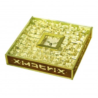
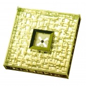
The Xmatrix Quadrus is a quality new, beautiful and mesmerizing three-dimensional ball-in-a-box puzzle. It is unlike any puzzle you have ever seen before, being a cross between game and art-piece. The translucent, pixelated, crystalline layers play with light in a stunningly sculptural and interactive way.
Most puzzles of this type are visual mazes. Quadrus is visual as well as mental, in that the path only reveals itself during play. Remember the shape of this invisible path and you can find your way.
The puzzle looks and feels elegant and luxurious and is self-contained with no pieces to lose. It has small raised corners to help prevent surface scratching and stop it slipping out of your hand. The handy size makes it easy to hold, easy to stack in-store and easy to transport.
The name was developed from the qualities of the product. X (marks the spot, and is the unknown factor), Matrix (cavity in which something is formed, and elements in rows and columns). The unique ambigram logo was developed to fit onto the product and the packaging, so that it always reads correctly and plays on the idea that you have to 'turn it upside-down'. The packaging allows maximum visibility, so the customer can see and try-out the product. The instructions are simple to understand and the overall concept can be developed.
An affordable addictive futuristic gift, a collectable coffee-table conversation piece or an artistic object of contemplation?
OPERATION / FLOW / INTERACTION:
The player tilts and flips the box to navigate the ball from the central GOLD framed X, through the matrix, into the opposite SILVER framed X and back again. (The end point is literally 2mm away from the start on the other side of the central platform, but the route travels through ALL the labyrinth). The challenge is to complete the game in the shortest possible time. Do it in 5 minutes and you are a 'Genius!'.
With patience you learn to identify the built-in clues, landmarks and hurdles, gradually overcoming the feeling of disorientation. Remembering the path already travelled helps you to develop a mental mind-map of the labyrinth.
Challenges memory, spatial awareness and hand-eye coordination. Age 8+.
PROJECT DURATION AND LOCATION:
The project started as a spare time project on my kitchen table in Portugal in 1999. The project sat in a box for 11 years until I moved to Cornwall, UK and decided to 'go for it' and tool-up in 2010. First production delivered to UK end of October 2010. (Just made it in time for Christmas!).
FITS BEST INTO CATEGORY:
Toys, Games and Hobby Products Design
|
PRODUCTION / REALIZATION TECHNOLOGY:
Injection moulded acrylic box, into which is put three injection moulded GPPS layers (with added florescence so it glows in UV light), two frames -gold and silver plated, white X platform, four gold foil side logos and chromed steel ball. Box is ultrasonically welded shut.
Sliding drawer window-box packaging, recycled and recyclable card, 3 colour print with gold foil and UV varnish. (Printed internal drawer for enjoyment factor).
Sealed in a shrink wrap with 'Shortlisted Gift of the Year' label applied.
SPECIFICATIONS / TECHNICAL PROPERTIES:
Product: 142 x 142 x 30 mm
Packaging: 190 x 190 x 32 mm
TAGS:
puzzle maze gift game labyrinth ambigram
RESEARCH ABSTRACT:
I developed it for self amusement. Slowly I made accurate laser-cut prototypes, knowing that sometime hopefully it would come to fruition. Having studied product design I knew that the design had to work for production. Having worked as a graphic and packaging designer in the gift industry, I knew that it had to look like an exciting, expensive present, even though the cost price is low. If it looks cheap and tacky or is too easy it will end up in the cupboard. So I made it look expensive, timeless, interesting and difficult, then it will spend more time on the desktop as an interior accessory. Research was only done after I designed the product, prior to applying for a Patent. I showed it to various puzzle manufacturing companies and ultimately decided to 'go-it-alone�39;.
CHALLENGE:
The hardest part was trying to find out if anything like this had been made before, oh, and finding the money to pay for the tooling and start it as a business.
I have designed absolutely everything myself and learned a lot in the process.
And this is just the beginning!...
ADDED DATE:
2012-02-01 15:51:28
TEAM MEMBERS (1) :
Jeremy Goode
IMAGE CREDITS:
Jeremy Goode, 2011.
|


