DESIGN NAME:
White Paper
PRIMARY FUNCTION:
Office of An Interior Design Firm
INSPIRATION:
“Life is a leaf of paper white, thereon each of us may write his word or two.” ——Amy Lowell. When designing for an office, one almost always treats it as a chance to put across a thought, a statement, or even a manifesto that represents the company. Its space merely becomes a billboard that accommodates nothing more than an image – equivalence of a commercial advertisement. For that reason, when it comes to designing an interior designer’s office, heavy ornamentation could be interpreted as ostentatious. Perhaps in this case we could start from “blank”.
UNIQUE PROPERTIES / PROJECT DESCRIPTION:
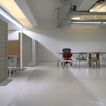
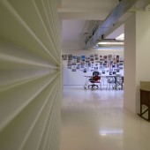
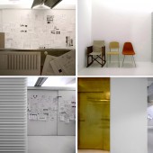
A canvas-like interior materializes while creating opportunities for myriad exhibition of design process. As each project progresses, the walls and the boards are covered with researches, design sketches and presentations to record the evolution and development of every decision. Overtime, such accumulation of works becomes a culminated diary for designers.
Similarly, white floors and brass door, a unique and daring attempt for a robust daily use, can record and collect the footprints and fingerprints from the staffs and the clients, representing the growth of the company as it ages. What seems to be on display in this office is the effort being spent on any given moment. The office will be a clean slate after each project, getting ready for a new one to commence.
OPERATION / FLOW / INTERACTION:
-
PROJECT DURATION AND LOCATION:
This office is located in Hong Kong started in August 2009 and finished in May 2010.
FITS BEST INTO CATEGORY:
Interior Space and Exhibition Design
|
PRODUCTION / REALIZATION TECHNOLOGY:
Supporting such freedom of display is the installation of plentiful storage. Located behind the sliding white boards, the mess created by designers is readily covered up. Criteria for material selection in this design are visual tidiness and orderliness, as well as environmental awareness and cost concern. For example, cable management is done by stringing of the used plastic capsules from capsule toys; the worktops are made of recycled wood fibre chipboards. Dividing panels of each workstation are only from the worktop up, meaning economy of material on the lower level. The point of interest lies in the way these materials have been treated.
SPECIFICATIONS / TECHNICAL PROPERTIES:
-
TAGS:
white paper, blank, diary, storage
RESEARCH ABSTRACT:
-
CHALLENGE:
To arrive at a decision to be a blank sheet, the inspiration does not come from any superficial whim. Working from the brief that has the usual inventory of a conventional office, with a twist of the chaotic routine of a design firm, the design demands a new concept of working disposition. In fact the programmatic dynamism of a design office cannot be contained by a simple open space. In such sense, an office is never a blank. On the contrary, in an attempt to set free the design from its physical constraints, one has to adopt a multifaceted framework for the design to grow with needs.
The realization of the project depends upon achieving ideal solutions for two very contradicting needs: maximum hidden surfaces (the mess concealer) and maximum open surface (the mess promoter). The result is a sensible combination of the two. The lift doors open onto a stripped clean lobby where there is a brass door. Inside, a 300 sq m full of crispy white daylight awaits. It is the light reflected from the white ceilings, walls, pin boards and floors just like the glow of clean laundry.
ADDED DATE:
2010-10-28 16:06:02
TEAM MEMBERS (5) :
Lam Wai Ming, Fanny Leung, Esther Yeung, Kent Wong and
IMAGE CREDITS:
Lam Wai Ming, 2010.
|


