DESIGN NAME:
Utrecht City Theatre
PRIMARY FUNCTION:
Corporate identity
INSPIRATION:
-
UNIQUE PROPERTIES / PROJECT DESCRIPTION:
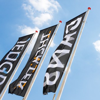
Utrecht City Theatre - a place where artistic quality, engagement, adventure, passion and skill come together. The interaction between visitors and performers is a sparkling and emotional adventure, often leading to reflective moments.
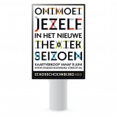
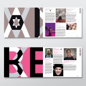
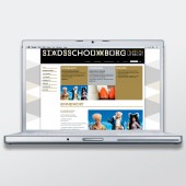
The custom typeface and logo are based on the words “shimmering” and “reflection”. The typography and color scheme reflect the zeitgeist of Dudok, architect of the theatre building. The edgy play of letters positions the theatre self-consciously in the present time. The style allows inspiration to grow into a powerful cultural brand.
OPERATION / FLOW / INTERACTION:
-
PROJECT DURATION AND LOCATION:
The project started in spring 2008.
The visual identity was launched in June 2009.
Edenspiekermann continues to work on seasonal changes in the identity system.
FITS BEST INTO CATEGORY:
Graphics, Illustration and Visual Communication Design
|
PRODUCTION / REALIZATION TECHNOLOGY:
-
SPECIFICATIONS / TECHNICAL PROPERTIES:
-
TAGS:
-
RESEARCH ABSTRACT:
-
CHALLENGE:
-
ADDED DATE:
2010-10-14 02:44:11
TEAM MEMBERS (8) :
Edo van Dijk, Earik Wiersma, Hannah Manneke, Carmen Nutbey, Jenny Labaar, Arjan van Zeumeren, Jan Dirk Porsius and
IMAGE CREDITS:
Edenspiekermann Amsterdam, 2010.
|


