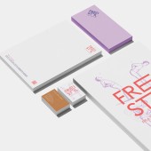
Freistil Corporate Identity by Ina Oakley |
Home > Winners > #171891 |
 |
|
||||
| DESIGN DETAILS | |||||
| DESIGN NAME: Freistil PRIMARY FUNCTION: Corporate Identity INSPIRATION: The client took over an existing traditional physiotherapy business and wanted to bring her own style and energy to it. This freshness, together with her mission to get people active and moving, served as inspiration for Freistil’s corporate design: modern and innovative while at the same time reflecting the tradition of the craft. UNIQUE PROPERTIES / PROJECT DESCRIPTION: The challenge of the project was to create a complete new corporate design for print and web reflecting the both the character of the established practice and the new energy being brought to it. The new name chosen for the relaunch was Freistil. This translates literally as a free style. For the new owner Katrin Caspary, this meant that although the desired results of any treatment are known, the way to achieve these is variable and depends on the capabilities and limitations of each customer. Katrin Caspary and her expert team blend traditional and modern therapies, creating tailored treatments for individual needs. Freistil is a place for recovery, inspiration, and well-being, where patients are encouraged to breathe freely, embrace new perspectives and heal. OPERATION / FLOW / INTERACTION: In order to reflect the motives of movement, flexibility, freedom, and the combination of modern approaches and traditional methods, the design uses both illustrative elements and a dynamic text based logo. The color scheme of purple, coral, off-white, and blue represent creativity, freshness, and competence. The illustrations link traditional craftsmanship with modern ideas, while the logo's stretch effect symbolises both movement and the modern open approach of the practice. PROJECT DURATION AND LOCATION: The project started in february 2023 and finished in september 2023 near of Cologne in Germany. FITS BEST INTO CATEGORY: Graphics, Illustration and Visual Communication Design |
PRODUCTION / REALIZATION TECHNOLOGY: Fine papers and sustainable materials were chosen to reflect the quality of the Freistil brand. These align with the spirit of our times. Modern, open and fresh. Wherever possible, local suppliers and partners where used. Each piece tells a story. One of care, respect for the environment, and dedication to creating something truly special. The focus on quality isn’t just a strategic decision. It’s a heartfelt expression of authenticity. SPECIFICATIONS / TECHNICAL PROPERTIES: Business cards (85 x 55 mm) and banners (3 m x 1 m) use designs reflecting the brands values: modern, fresh, and quality driven. For clothing articles such as sweaters, beanies and bags, the finest available sustainable materials and premium organic fabrics were used. These ensure not just comfort but also a sense of responsibility. Web design was made in XD and programming was based on WordPress. TAGS: Health, Openminded, Rethinking, Modern, Tradition, Freedom RESEARCH ABSTRACT: Our goal was to blend tradition with modernity. Katrin took over a well-established practice that had been successfully run for 15 years. While the existing customer base was strong, attracting younger clients was crucial. The new concept needed to appeal to all ages and engage the team. To achieve this, I researched modern and traditional practices in books and online. Additionally, I spoke with locals and interviewed them about their methods. CHALLENGE: The established practice had loyal older clients but struggled to attract younger people. Updating the concept to appeal to both groups was key. This required a fresh brand identity, improved communication (possibly via social media), and motivating the team to embrace change. Maintaining trust while introducing modern elements was essential for success. The design needed to appeal to both young and old and to lower the perceived barrier to becoming more active. ADDED DATE: 2025-03-13 07:32:43 TEAM MEMBERS (1) : Ina Oakley and Anne-Marie Bayer IMAGE CREDITS: Mockup Maison, Adobe Firefly and Nastasic PATENTS/COPYRIGHTS: buero inaoakley, 2024 |
||||
| Visit the following page to learn more: https://praxiscaspary.de | |||||
| AWARD DETAILS | |
 |
Freistil Corporate Identity by Ina Oakley is Winner in Graphics, Illustration and Visual Communication Design Category, 2024 - 2025.· Read the interview with designer Ina Oakley for design Freistil here.· Press Members: Login or Register to request an exclusive interview with Ina Oakley. · Click here to register inorder to view the profile and other works by Ina Oakley. |
| SOCIAL |
| + Add to Likes / Favorites | Send to My Email | Comment | Testimonials | View Press-Release | Press Kit |
Did you like Ina Oakley's Graphic Design?
You will most likely enjoy other award winning graphic design as well.
Click here to view more Award Winning Graphic Design.


