DESIGN NAME:
Powerbuilding
PRIMARY FUNCTION:
Brand Identity
INSPIRATION:
PowerBuilding was inspired by a scientific, data-driven approach to training that combines research with athletic performance. Its visual identity is grounded in laboratory aesthetics, symbolizing experimentation and precision. Inspiration was drawn from technological interfaces, superhero films, and space exploration to make the project both functional and engaging.
UNIQUE PROPERTIES / PROJECT DESCRIPTION:
PowerBuilding is a fitness project based in New York, with a mission to integrate science and strength training. It includes a physical gym space, a mobile application, personal trainers, and more. The core focus lies in tracking workouts, health status, and nutrition using data-driven methods to provide personalized recommendations.
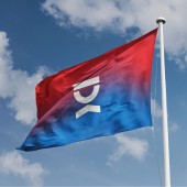
As a result, the visual identity emphasizes graphics that represent these three pillars: circles symbolize nutrition, zigzag lines reflect health, and straight lines stand for strength training. Two contrasting typefaces were combined — a bold, extended grotesque to convey power and stability, and a monospaced, tech-inspired font to highlight the scientific approach. The client insisted on using red and blue colors; however, these were already widely used across the U.S. fitness market. The proposed solution was to apply a gradient — a graphic technique that distinguishes PowerBuilding from its competitors. The outcome is a cohesive digital and brand identity.
OPERATION / FLOW / INTERACTION:
My project is a brand identity. It provides direct value both to the business owner and the company’s clients.
For the business, it helps communicate meaning and key messages, attract attention, and stand out from competitors.
For users, the brand identity ensures clear and high-quality delivery of relevant and important information.
PROJECT DURATION AND LOCATION:
This project began in November 2020 and was completed in January 2021. The work was carried out in Kyiv, Ukraine. The customer was located in New York, USA.
FITS BEST INTO CATEGORY:
Graphics, Illustration and Visual Communication Design
|
PRODUCTION / REALIZATION TECHNOLOGY:
Digital printing
SPECIFICATIONS / TECHNICAL PROPERTIES:
-
TAGS:
Identity, Logo, Sport, Brand Identity
RESEARCH ABSTRACT:
During the project, research was conducted on the client’s business, its market, competitors, and target audience. The goal was to identify unique characteristics that could serve as the foundation for building a recognizable brand identity. The research included desk research and interviews. Participants included business owners and respondents (potential users of the business). The results revealed insights and pain points of athletes, which formed the basis for the brand messaging and communication design. The visual identity was also developed based on these findings.
CHALLENGE:
A thorough analysis was conducted during the development of the project, including market and competitor research. In-depth interviews were held with representatives of the target audience to explore their needs, pain points, and challenges. This process helped shape a cohesive and relevant visual identity, along with compelling copy for effective communication.
ADDED DATE:
2025-02-28 10:27:39
TEAM MEMBERS (1) :
Anton Bukoros
IMAGE CREDITS:
Image #1: Photographer Lorenzo Fattò Offidani (Unsplash Free to use), Variations, 2020. ]
Image #2, It is free to use mock up (photorealistic graphic design)
Image #3, It is free to use mock up (photorealistic graphic design)
Image #4: Photographer Anton Bukoros
Image #5: Photographer Anton Bukoros
|


