Honki Factory Visual Identity by Daichi Takizawa |
Home > Winners > #170847 |
 |
|
||||
| DESIGN DETAILS | |||||
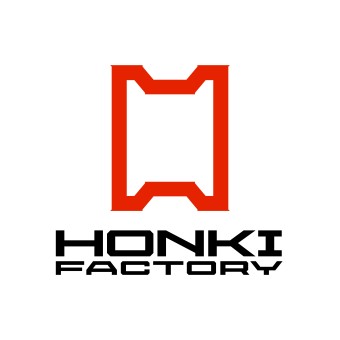
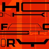
| DESIGN NAME: Honki Factory PRIMARY FUNCTION: Visual Identity INSPIRATION: Honki Factory needed to update its visual identity to achieve its vision of "Establishing entrepreneurship training centers." The specific goals were to gain credibility from large corporations and to enhance the company's branding for recruitment. Therefore, a visual identity that represents the company's vision was essential. UNIQUE PROPERTIES / PROJECT DESCRIPTION: The logo reflects the concept of a "Establishing entrepreneurship training centers" where various people, both corporate and individual, can learn about entrepreneurship and increase the number of people willing to take on challenges. The logo was inspired by the "frame" representing the shape of new businesses and the "factory" symbolizing production. The adaptable "H" shaped symbol mark and the variable design of the logotype express that the company can support any type of business. OPERATION / FLOW / INTERACTION: After changing the visual identity, despite having only about 10 employees, the company secured service agreements with over 30 major Japanese corporations within a year. This proves that the visual identity is effective and gives large companies a sense of trust and credibility. PROJECT DURATION AND LOCATION: This project started in June 2022 and was completed in March 2024. FITS BEST INTO CATEGORY: Graphics, Illustration and Visual Communication Design |
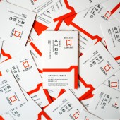
PRODUCTION / REALIZATION TECHNOLOGY: "Honki" means "Seriousness,&q SPECIFICATIONS / TECHNICAL PROPERTIES: The visual design was created using Adobe Illustrator, and the corporate font was made with the font creation software Glyphs. TAGS: VI, Visual Identity, Logo, Symbol, Corporate font, Poster, Website, Stationery, Variable RESEARCH ABSTRACT: I focused on enhancing the quality of the details. The logo was carefully examined for aspect ratio, the thickness of vertical and horizontal strokes, and optical balance. For the corporate font, in addition to optical adjustments, each character's width and side spacing were precisely calculated. Over 500 test patterns were evaluated during this process. As a result, I won the Silver Award at the Graphis Design Awards 2025 (USA) and were featured in the Japan Typography Yearbook 2025, enhancing Honki Factory Co.,Ltd's brand value. CHALLENGE: The biggest challenge was how to implement the newly created visual identity. The company's members are not designers, and the application they use most is PowerPoint. To make the VI easy to use, we created PowerPoint templates where users only need to replace text. We also predefined the corporate fonts and colors. Background images for video conferencing and business cards were designed to allow simple text updates, ensuring that anyone can effectively represent Honki Factory Co.,Ltd's corporate identity, regardless of their role. ADDED DATE: 2025-02-28 08:43:38 TEAM MEMBERS (1) : IMAGE CREDITS: Image #1, Art director Daichi Takizawa, Corporate Logo , 2024 Image #2, Art director Daichi Takizawa, Corporate Font, 2024 Image #3, Art director Daichi Takizawa, Website, 2024 Image #4, Art director Daichi Takizawa, Name card, 2024 Image #5, Art director Daichi Takizawa, Poster, 2024 |
||||
| Visit the following page to learn more: https://honki-factory.co.jp/ | |||||
| AWARD DETAILS | |
 |
Honki Factory Visual Identity by Daichi Takizawa is Winner in Graphics, Illustration and Visual Communication Design Category, 2024 - 2025.· Read the interview with designer Daichi Takizawa for design Honki Factory here.· Press Members: Login or Register to request an exclusive interview with Daichi Takizawa. · Click here to register inorder to view the profile and other works by Daichi Takizawa. |
| SOCIAL |
| + Add to Likes / Favorites | Send to My Email | Comment | Testimonials | View Press-Release | Press Kit |
Did you like Daichi Takizawa's Graphic Design?
You will most likely enjoy other award winning graphic design as well.
Click here to view more Award Winning Graphic Design.


