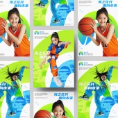
DESIGN NAME:
Hyzy World Youth Activity Center
PRIMARY FUNCTION:
Corporate Identity
INSPIRATION:
The Hyzy World Youth Activity Center is an extensive architectural complex. Incorporating too many intricate details in the logo would make it overly complex and difficult to recognize. Instead, the design focuses on the most frequently mentioned architectural feature of HYZY World: the arch. This key element is combined with a circular form, symbolizing wholeness and perfection. By transforming the logo from a flat design into a three-dimensional structure, it achieves an open, converging form rich in meaning and depth.
UNIQUE PROPERTIES / PROJECT DESCRIPTION:
HYZY World Youth Activity Center is the largest youth activity center in China, with a total construction area of approximately 100,000 square meters. The brand owner sought a logo that is modern and minimalist while conveying the spirit of care in youth education, the pursuit of excellence, and a forward-looking vision. Additionally, the design needed to reflect the architectural characteristics of the center.
Instead of adopting a traditional two-dimensional design approach, the HYZY World logo reinterprets the circular form in a three-dimensional space. This approach preserves the integrity of the ring while creating an open and dynamic structure that seamlessly incorporates the center’s iconic arch element. The logo is versatile for both graphic applications and three-dimensional spatial installations. The central arch not only reflects the architectural features but also symbolizes the "Gateway to the Future."
The most unique and heartfelt aspect of the design lies in its hidden “heart” Easter egg: when viewed from a top-down perspective, the logo naturally forms a heart shape, and under specific lighting conditions, the projected shadow also reveals a heart. This dual-heart concept perfectly embodies HYZY World Youth Activity Center’s core philosophy of "educating with love."
The mascot design is inspired by the only figurative building within the Hyzy World Youth Activity Center complex: the Whale Theater. The two mascots are adorable whale avatars—one representing a boy and the other a girl—both dressed in playful whale-themed outfits full of energy and charm. The white shape on their chests reflects the signature arch of the building. A hidden design easter egg adds an extra layer of creativity: when viewed from a top-down perspective, the mascots together form the image of two cute little whales.
OPERATION / FLOW / INTERACTION:
Initially, the owners of The HYZY World Youth Activity Center conducted a three-month logo design competition, but the submitted designs did not meet expectations. As a result, they reached out to us. After more than two months of in-depth research and exploration of design concepts, we submitted the logo and mascot design proposal in May 2024, which was ultimately approved. The brand owner was highly satisfied with the designs and gave them high praise and recognition.
PROJECT DURATION AND LOCATION:
The project was launched in December 2023 in Shanghai, China, and will conclude in May 2024. Location: 6258 Dongfang Meigu Avenue, Shanghai, China.
FITS BEST INTO CATEGORY:
Graphics, Illustration and Visual Communication Design
|
PRODUCTION / REALIZATION TECHNOLOGY:
-
SPECIFICATIONS / TECHNICAL PROPERTIES:
-
TAGS:
Logo, Branding, IP Design, Mascot design
RESEARCH ABSTRACT:
We conducted in-depth research into the architectural form and design concept of the Hyzy World Youth Activity Center. We made extensive design attempts focusing on using the architectural shape as the primary design element for the logo. Additionally, we explored breakthroughs in logo design, transitioning from two-dimensional to three-dimensional design concepts.
CHALLENGE:
Integrating the circular form with the building’s signature arch while maintaining an open and minimalist aesthetic posed a significant design challenge. To overcome this, I moved beyond traditional two-dimensional design and reinterpreted the circular shape in three-dimensional space. This approach preserved the integrity of the circle while introducing a dynamic, open structure that seamlessly incorporates the building’s arch.
In its three-dimensional form, the central arch of the logo not only reflects the architectural identity but also symbolizes the “Gateway to the Future.” Additionally, a hidden design element enhances its emotional impact: when viewed from above, the logo naturally forms a heart shape, and under specific lighting conditions, its shadow also casts a heart. This dual-heart concept beautifully embodies Hyzy World Youth Activity Center’s core philosophy of “nurturing with love.”
ADDED DATE:
2025-02-28 01:29:23
TEAM MEMBERS (3) :
Creative Director: Shan Hao, Art Director: Du Weimiao and Graphic Designer: Hua Yizhou
IMAGE CREDITS:
All Copyrights ECUST-Creplus Design, 2025
PATENTS/COPYRIGHTS:
All Copyrights ECUST-CRE+ Design, 2025
|


