| THE AWARD |
| CATEGORIES |
| REGISTRATION |
| SUBMIT YOUR WORK |
| ENTRY INSTRUCTIONS |
| TERMS & CONDITIONS |
| PUBLICATIONS |
| DATES & FEES |
| METHODOLOGY |
| CONTACT |
| WINNERS |
| PRESS ROOM |
| GET INVOLVED |
| DESIGN PRIZE |
| DESIGN STORE |
| THE AWARD | JURY | CATEGORIES | REGISTRATION | PRESS | WINNERS | PUBLICATIONS | ENTRY INSTRUCTIONS |
Hyzy World Youth Activity Center Corporate Identity by Creplus Design | Hao SHAN |
Home > Winners > Design #170638 >Interview |
 |
|
FS: What is the main principle, idea and inspiration behind your design?
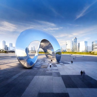
SH: The core principle behind the design was to create a modern and minimalistic brand identity that conveys educational care, a pursuit of excellence, and a vision for the future. The inspiration came from the architectural language of the HYZY World Youth Activity Center—particularly its iconic arch form—which I combined with a circular shape symbolizing wholeness and unity. By reinterpreting this form in 3D, the logo becomes both a visual symbol and a spatial experience.
FS: What has been your main focus in designing this work? Especially what did you want to achieve?
SH: My main focus was to design a brand identity that breaks from the conventions of typical youth center logos in China. I aimed to develop a visual system that is both iconic and meaningful, incorporating spatial and emotional dimensions. I especially wanted to embed the spirit of love and care through the hidden heart-shaped Easter egg—visible from the top view and through the shadow of the structure—to express the brand’s core educational philosophy.
FS: What are your future plans for this award winning design?
SH: I hope the design concept—especially the hidden heart-shaped Easter egg that represents love and care—can gain wider recognition. I believe this approach, blending symbolism with spatial interactivity, can inspire future branding practices and open new possibilities in how visual identity communicates values beyond the surface.
FS: How long did it take you to design this particular concept?
SH: It took over two months of in-depth research, exploration, and iteration to finalize the concept and design. I spent a significant amount of time experimenting with forms and refining the integration of spatial dynamics and emotional storytelling.
FS: Why did you design this particular concept? Was this design commissioned or did you decide to pursuit an inspiration?
SH: This was a commissioned project. The client reached out to me after conducting a nationwide logo design competition that didn’t produce satisfactory results. They trusted me to solve this challenge, and I took it as an opportunity to explore new territory in branding design—integrating architectural features and emotional resonance in a fresh and unconventional way.
FS: What made you design this particular type of work?
SH: I was deeply motivated by the challenge of redefining what a youth center brand could look like in China. Most existing logos lacked emotional depth and relied heavily on clichéd visual formulas. I wanted to create a brand identity that not only looked contemporary and iconic but also conveyed meaningful values—like love, care, and future-oriented education—through thoughtful form and spatial experience. This project gave me the opportunity to push beyond conventional two-dimensional logo design and explore how branding can live in three dimensions and emotionally connect with its audience.
FS: What sets this design apart from other similar or resembling concepts?
SH: Unlike traditional youth center logos that often rely on flat, generic graphics, this design transforms the logo into a spatial experience. It integrates the architectural identity of HYZY World—specifically the arch motif—into a three-dimensional circular form that symbolizes unity and openness. What truly sets it apart is the hidden “heart” concept: from a top-down view and through its shadow under specific lighting, the logo reveals a heart shape, subtly embodying the spirit of care in education. This dual-layer emotional symbolism, combined with architectural integration, makes the design both conceptually rich and visually distinctive.
FS: What is the most unique aspect of your design?
SH: The most unique aspect is the hidden dual-heart concept embedded within a three-dimensional circular structure. When viewed from above or under specific lighting, the logo reveals a heart shape—both in form and in shadow—symbolizing love and care in education. This poetic, interactive element transforms the logo into an emotional and spatial experience, making it more than a symbol—it becomes a story.
FS: Is your design influenced by data or analytical research in any way? What kind of research did you conduct for making this design?
SH: Yes, my design process was strongly informed by analytical research. After taking on the project, my team and I collected and studied the logos of major youth activity centers across China. In our first meeting with the client, I presented a comparative analysis of these logos and emphasized that the HYZY World Youth Activity Center logo must break away from the superficial and formulaic visual styles typically seen in this sector. This commitment to avoiding homogeneity and striving for innovation shaped the entire creative direction—posing both a significant challenge and an exciting opportunity for breakthrough design.
FS: What are some of the challenges you faced during the design/realization of your concept?
SH: One of the biggest challenges was how to reflect the scale and architectural complexity of the HYZY World Youth Activity Center—China’s largest youth center—within a logo that remains simple, modern, and instantly recognizable. Directly illustrating the building would have made the logo too complex and hard to identify. Another challenge was to embed meaningful symbolism without overloading the design. It took a long period of exploration to arrive at a 3D reinterpretation of the arch and circular form that subtly embodies ideas of openness, unity, care, and the future—all while maintaining functional versatility in both flat and spatial applications.
FS: How did you decide to submit your design to an international design competition?
SH: I believe this work represents a breakthrough from traditional logo design conventions, especially in how it integrates three-dimensional thinking and emotional symbolism. I wanted more people around the world to see and understand this approach. Submitting it to a prestigious and influential competition like the A’ Design Award was my way of validating the creativity and strength of the concept on an international stage—and ensuring it would be recognized and remembered.
FS: Any other things you would like to cover that have not been covered in these questions?
SH: Yes—one major challenge that hasn’t been mentioned was related to the name “HYZY World.” The Chinese name translates to “Flower of the Sea,” and initially I thought of integrating imagery of the ocean and flowers with youthful elements. However, in our very first meeting, the client made it clear they did not want any ocean or floral elements in the logo, as these did not reflect the brand’s true essence. This was the first time I encountered a brand that asked for no visual connection between the name and the logo—making the creative process far more demanding. Interestingly, the English name “HYZY World” was derived from the Chinese pronunciation and is an abbreviation for “Happy Youth & Zippy Youth World.”
FS: Thank you for providing us with this opportunity to interview you.
A' Design Award and Competitions grants rights to press members and bloggers to use parts of this interview. This interview is provided as it is; DesignPRWire and A' Design Award and Competitions cannot be held responsible for the answers given by participating designers.
| SOCIAL |
| + Add to Likes / Favorites | Send to My Email | Comment | View Press-Release |


