DESIGN NAME:
Restbase
PRIMARY FUNCTION:
Logo And Corporation Identity Design
INSPIRATION:
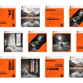
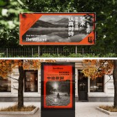
The brand philosophy "disciplined rest fuels peak performance" became the creative catalyst. The logo embodies this through structural rigor in letterforms contrasting with fluid negative space. The intentional gap acts as a visual manifesto – rejecting passive downtime in favor of strategic recalibration. Warm orange radiates energized comfort, while monochrome photography conveys meditative stillness. Each element systematically rebrands rest from passive state to strategic investment.
UNIQUE PROPERTIES / PROJECT DESCRIPTION:
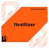
RestBase's identity system redefines rest through a hybrid visual language. The wordmark logo blends serif/sans-serif hybrid typography with the deliberate gap, balancing stability and fluidity to visualize intentional rest. The RB monogram from Logo emerges as a bold visual hammer, dynamically extending into angular framing patterns, synergizing with energizing comforting orange and monochrome photography to assert the core philosophy: disciplined rest fuels peak energetic performance.
OPERATION / FLOW / INTERACTION:
RestBase operates as a science-driven brand helping individuals achieve peak performance through proactive rest. It delivers rest-related knowledge, methods, and designed products, providing users with scientific recovery solutions. This design helps users intuitively recognize RestBase's expertise, transforming rest from passive downtime into an actively optimized discipline essential for sustained excellence.
PROJECT DURATION AND LOCATION:
The project started in April 2024 in Beijing and finished in November 2024 in Beijing.
FITS BEST INTO CATEGORY:
Graphics, Illustration and Visual Communication Design
|
PRODUCTION / REALIZATION TECHNOLOGY:
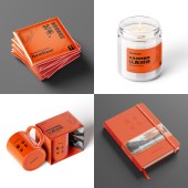
Production utilizes sustainable materials, ensuring each physical embodiment of the brand is eco-friendly. The precise execution involves high-quality print technology on recyclable substrates, reflecting the brand’s commitment to environmental responsibility.
SPECIFICATIONS / TECHNICAL PROPERTIES:
Primary logo: 6mm minimum height for print. Others can be printed or displayed in various size.
TAGS:
Rest, Brand Identity, Corporation Identity, RestBase, Visual Identity
RESEARCH ABSTRACT:
Meta-analysis neuroscience studies and consumer surveys with 240 participants revealed strategic rest intervals significantly enhance cognitive performance. Color perception tests identified orange as optimal for balancing energy and comfort. Typography studies led to a hybrid serif-sans wordmark with intentional gaps, visually encoding active recovery principles. These findings informed RestBase's evidence-based design system that repositions rest as measurable productivity accelerator.
CHALLENGE:
The core challenge was redefining rest as an active strategy – a novel concept requiring visual departure from traditional "tranquility" motifs. Balancing "action" and "rest" demanded avoiding passive aesthetics like muted tones, instead using warm vitality to express intentional recovery. The solution emerged through the logo's hybrid typography (bridging structure/motion) and VI elements like dynamic orange gradients, collectively framing rest as disciplined preparation for excellence.
ADDED DATE:
2025-02-26 03:57:37
TEAM MEMBERS (1) :
Chen Xu, Huang Hao, Dr. Zhang Rong, Liu Beibei, Hao Qian, Wu Fangbo, Li Shulong, Li Jiaxu, Zhang Mingjie, Gao Jingyan, Dr. Wang Lijing, Tian Jianing
IMAGE CREDITS:
sxdesign
PATENTS/COPYRIGHTS:
sxdesign
|
