DESIGN NAME:
Arrival Training
PRIMARY FUNCTION:
Brand Identity
INSPIRATION:
One of my main inspirations for the project was to ensure that the visual identity simultaneously conveys the positive message embedded in the term Arrival for those new to the sport of running, while also highlighting the hidden meaning of rival, symbolising a competitive, motivated individual and the positive impact of a strong competitive spirit.
UNIQUE PROPERTIES / PROJECT DESCRIPTION:
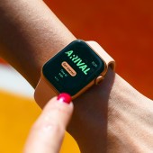
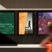
Arrival is an online training planner and tracking service for amateur runners. The logotype visually hints at the duality of the wordplay between Arrival and A Rival, through the positive-negative trick of the R letter. The slanted typography adds dynamism and movement to the design. The unique angle of the logotype is reflected across the visual identity, determining the illustration style, the structure of icons, and the layout arrangements.
OPERATION / FLOW / INTERACTION:
The service aims to provide a personalized experience for users with different sporting backgrounds, goals, and motivations through tailored training sessions. The interface design and graphical elements should make it as easy and intuitive as possible for individuals to incorporate their workouts into their daily routines. Additionally, communication should support users in understanding the service and introduce them to its unique features.
PROJECT DURATION AND LOCATION:
The project started in February 2024 and was finished in October 2024 in Hungary.
FITS BEST INTO CATEGORY:
Graphics, Illustration and Visual Communication Design
|
PRODUCTION / REALIZATION TECHNOLOGY:
The graphic element set like the illustration style, the structure of icons, and the layout arrangements not only ensures a coherent appearance but also lends a distinctive visual language to the brand. The pattern created from the element of the R character also appears on surfaces, abstractly referencing the checkered flag waved at the finish line. The communication thus remains authentic and aligned with the characteristics of the brand, while appearing contemporary, fresh and playfully engaging.
SPECIFICATIONS / TECHNICAL PROPERTIES:
In print, the brand identity was applied across various-sized posters, stickers, and merchandise, while in digital form, it was extended to UI interfaces and social media platforms, ensuring responsiveness and adapting to the specific requirements of each platform.
TAGS:
branding, identity, sport, running, illustration, digital, logo, visual identity,
RESEARCH ABSTRACT:
For Arrival, it was essential to define the brand in relation to its competitors and to identify the target audience. Persona development was a crucial phase, but the spectrum ranged widely, from a mother eager to start running to a mid level executive training for a marathon. This required further refinement, such as defining the age range and assessing the willingness to spend on the hobby. These insights played a key role in shaping the visual identity of the brand.
CHALLENGE:
The biggest challenge of the project was to create a brand identity that is informative and easy to use for a broad audience of athletes and aspiring athletes while remaining engaging and vibrant. The design had to be flexible enough to optimally address users across various platforms, ensuring a seamless experience regardless of the medium.
ADDED DATE:
2025-02-25 06:34:58
TEAM MEMBERS (1) :
IMAGE CREDITS:
Botond Voros, 2024.
|


