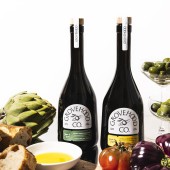
Grovehood Collective Branding by Cansu Dagbagli Ferreira |
Home > Winners > #168860 |
 |
|
||||
| DESIGN DETAILS | |||||
| DESIGN NAME: Grovehood Collective PRIMARY FUNCTION: Branding INSPIRATION: The design is inspired by the traditions of olive oil production, where life revolves around the harvest. This idea is captured in the brand symbol: an olive encircled by orbits, representing the families whose world turns around this precious fruit. A fusion of vintage aesthetics and contemporary minimalism enhances the product’s exclusivity. The color palette, drawn from nature, connects the golden hues of olive oil and the rich greens of the trees, capturing the essence of the Mediterranean. UNIQUE PROPERTIES / PROJECT DESCRIPTION: Grovehood Collective redefines olive oil branding by blending heritage with modern elegance. As the Netherlands' first transparent extra virgin olive oil brand, it sources from family-run, earth-friendly farms. The vintage inspired label, with refined typography, and custom cut design reflects craftsmanship and authenticity. Earthy yet vibrant colors distinguish each variant, while premium packaging invites consumers to explore the rich journey of this high-quality, traceable olive oil. OPERATION / FLOW / INTERACTION: First transparent extra virgin olive oil brand from Netherlands. The high quality olive oil is sourced from earth friendly family farms from different countries of Europe. The brand promise is to bring this high quality extra virgin olive oil that is single state, early harvest, hand picked and pressed the same day olive oil to gourmet audience. PROJECT DURATION AND LOCATION: Started in October 2024, finished in February 2025 Designed in France, Sold from Netherlands to EU FITS BEST INTO CATEGORY: Graphics, Illustration and Visual Communication Design |
PRODUCTION / REALIZATION TECHNOLOGY: The design thinking method of Diverge and Converge was used. All design was realized digitally as vector based assets with Adobe Creative Suite and then labels were produced by 4 color printing technique. SPECIFICATIONS / TECHNICAL PROPERTIES: 500 ml olive oil labels: 2 front labels (63 x 74 mm) and one back label (69 x 75 mm) TAGS: olive oil, gourmet, olive, packaging, label design, custom cut, branding RESEARCH ABSTRACT: A thorough competitor research was done online and offline. During the research phase we concluded that the product quality is superior to almost all of the products available in the market. We decided to go extra mile for the packaging design to reflect this quality. The bottle was chosen from many available options, we went for a special design that looks both unique and premium. Resembling to a wine bottle, the design evokes premium quality. It was sourced from a quality supplier and we decided to use custom cut labels for underlining the uniqueness of the product. CHALLENGE: Due to the bottle shape, the area we could use for the label was restricted, it required to be creative to create the layout while keeping the look appealing. Another creative challenge was to color match the different materials. The bottle labels are printed on PP while the pouches are printed on a layered plastic material. The color ADDED DATE: 2025-02-19 14:51:57 TEAM MEMBERS (1) : IMAGE CREDITS: Cansu Dagbagli Ferreira, 2024. |
||||
| Visit the following page to learn more: https://bit.ly/438lfHj | |||||
| AWARD DETAILS | |
 |
Grovehood Collective Branding by Cansu Dagbagli Ferreira is Winner in Graphics, Illustration and Visual Communication Design Category, 2024 - 2025.· Read the interview with designer Cansu Dagbagli Ferreira for design Grovehood Collective here.· Press Members: Login or Register to request an exclusive interview with Cansu Dagbagli Ferreira. · Click here to register inorder to view the profile and other works by Cansu Dagbagli Ferreira. |
| SOCIAL |
| + Add to Likes / Favorites | Send to My Email | Comment | Testimonials | View Press-Release | Press Kit |
Did you like Cansu Dagbagli Ferreira's Graphic Design?
You will most likely enjoy other award winning graphic design as well.
Click here to view more Award Winning Graphic Design.


