Bellamy Sans Typeface by Paul Robb and Moira Bartoloni |
Home > Winners > #167745 |
 |
|
||||
| DESIGN DETAILS | |||||
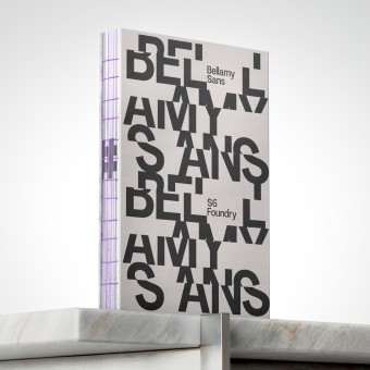
| DESIGN NAME: Bellamy Sans PRIMARY FUNCTION: Typeface INSPIRATION: The inspiration behind Bellamy Sans stems from a desire to bridge the gap between the functional clarity of mid-20th-century grotesque typefaces and the nuanced sophistication of contemporary design, embracing the idea of typographic neutrality—priorit UNIQUE PROPERTIES / PROJECT DESCRIPTION: Bellamy Sans is a contemporary sans-serif typeface that reimagines the grotesque style with a refined, modern sensibility. Rooted in the tradition of Swiss typography, it maintains the core principle of neutrality while softening the rigidity often associated with classic grotesques. Its subtle contrast and carefully shaped curves lend it an understated elegance—minimalis OPERATION / FLOW / INTERACTION: The Specimen book was sent to the first ten companies that ordered the complete family. PROJECT DURATION AND LOCATION: The initial designs were designed in November 2023 with the digital font launched in September 2024. FITS BEST INTO CATEGORY: Graphics, Illustration and Visual Communication Design |
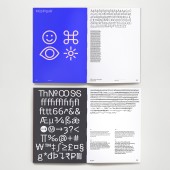
PRODUCTION / REALIZATION TECHNOLOGY: The font was digitally created and supported by over 200 Latin languages. The cover was printed onto a recycled board, the internal pages onto 150gsm recycled paper and the book was hand-sewn. SPECIFICATIONS / TECHNICAL PROPERTIES: The book is 120 pages, with the first section demonstrating the robustness of the font in use, the back pages are dedicated to the individual weights and glyphs. TAGS: Type design, Typeface, Specimen RESEARCH ABSTRACT: This research investigates the design philosophy and developmental process behind the font and explores how Bellamy Sans bridges the gap between the minimalist, utilitarian principles of historical grotesques and the nuanced sophistication of contemporary typography. Central to its design is typographic neutrality, emphasizing clarity, simplicity, and versatility. However, Bellamy Sans reinterprets these qualities through a more humanistic lens, introducing subtle refinements that balance mechanical precision with organic warmth. This research highlights the typeface’s role in evolving modern typographic practices, offering insights into how historical influences can be harmonized with contemporary design needs. CHALLENGE: The primary challenge of this research lies in exploring how the utilitarian principles of historical grotesque typefaces with the nuanced sophistication of contemporary typography. It required addressing how typographic neutrality, clarity, simplicity, and versatility concepts can be reinterpreted through humanistic forms without compromising their functional essence. Additionally, the research must investigate how subtle design refinements can contribute to the evolution of modern typographic practices while honoring historical influences. ADDED DATE: 2025-02-01 04:52:43 TEAM MEMBERS (2) : Paul Henry Robb and Moria Bartoloni IMAGE CREDITS: Paul Henry Robb |
||||
| Visit the following page to learn more: https://www.s6foundry.com/retail-font-li |
|||||
| AWARD DETAILS | |
 |
Bellamy Sans Typeface by Paul Robb and Moira Bartoloni is Winner in Graphics, Illustration and Visual Communication Design Category, 2024 - 2025.· Read the interview with designer Paul Robb and Moira Bartoloni for design Bellamy Sans here.· Press Members: Login or Register to request an exclusive interview with Paul Robb and Moira Bartoloni. · Click here to register inorder to view the profile and other works by Paul Robb and Moira Bartoloni. |
| SOCIAL |
| + Add to Likes / Favorites | Send to My Email | Comment | Testimonials | View Press-Release | Press Kit |
Did you like Paul Robb and Moira Bartoloni's Graphic Design?
You will most likely enjoy other award winning graphic design as well.
Click here to view more Award Winning Graphic Design.


