Rotary Sans Typeface by Paul Robb and Moira Bartoloni |
Home > Winners > #167715 |
 |
|
||||
| DESIGN DETAILS | |||||
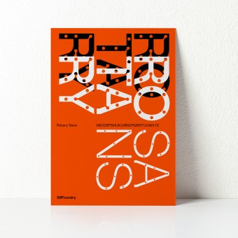
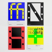
| DESIGN NAME: Rotary Sans PRIMARY FUNCTION: Typeface INSPIRATION: Rotary Sans draws inspiration from the interplay of geometry and functionality found in mid-century modern design, where clean lines and purposeful details create a sense of clarity and efficiency. The typeface takes cues from classic grotesque and neo-grotesque sans-serifs but reinterprets them with a contemporary twist—most notably through its distinctive pear drop-shaped ink traps. These ink traps not only enhance legibility but also introduce a subtle organic contrast to the structure. UNIQUE PROPERTIES / PROJECT DESCRIPTION: Rotary Sans is a modern OpenType sans-serif typeface that blends contemporary aesthetics with strong geometric contrasts. Its most distinctive feature is the pear drop-shaped ink traps, which add a unique visual character while enhancing legibility. Designed with versatility in mind, Rotary Sans includes an extended Latin glyph set, complete with alternative characters and ligatures, making it well-suited for a wide range of typographic applications. OPERATION / FLOW / INTERACTION: The presentation box was gifted to the first ten companies that purchased the complete typeface family. PROJECT DURATION AND LOCATION: Location Italy. The research project began in late 2023 and progressed through development, culminating in its production and launch in July 2024. FITS BEST INTO CATEGORY: Graphics, Illustration and Visual Communication Design |
PRODUCTION / REALIZATION TECHNOLOGY: The font was meticulously designed and digitally crafted, offering support for over 200 Latin-based languages. To celebrate its launch, a limited-edition specimen box was digitally printed, showcasing the typeface’s versatility and strength across various applications. SPECIFICATIONS / TECHNICAL PROPERTIES: The outer box 25 x 155 x 215 was digitally printed and then silver foil printed. The 20 postcards were printed on 300gsm natural paper cmyk. TAGS: Type design, Typeface, Specimen RESEARCH ABSTRACT: The initial research for Rotary Sans focused on striking a balance between geometric precision and functional versatility. The design process began with an in-depth study of mid-century modern typography, particularly the clean, efficient letterforms found in grotesque and neo-grotesque typefaces. These styles, known for their straightforward and utilitarian approach, served as a foundation for Rotary Sans, but the goal was to introduce a contemporary refinement that would make it more adaptable to modern branding and communication needs. CHALLENGE: The development of Rotary Sans presented several key design challenges, requiring a careful balance between form, function, and originality. One of the primary hurdles was achieving a distinctive aesthetic while maintaining the clarity and versatility expected of a contemporary sans-serif. The typeface needed to feel fresh and modern yet still be highly functional across a range of applications, from branding to editorial use. ADDED DATE: 2025-01-31 02:11:59 TEAM MEMBERS (2) : Paul Henry Robb and Moira Bartoloni IMAGE CREDITS: Paul Henry Robb |
||||
| Visit the following page to learn more: https://www.s6foundry.com/retail-font-li |
|||||
| AWARD DETAILS | |
 |
Rotary Sans Typeface by Paul Robb and Moira Bartoloni is Winner in Graphics, Illustration and Visual Communication Design Category, 2024 - 2025.· Read the interview with designer Paul Robb and Moira Bartoloni for design Rotary Sans here.· Press Members: Login or Register to request an exclusive interview with Paul Robb and Moira Bartoloni. · Click here to register inorder to view the profile and other works by Paul Robb and Moira Bartoloni. |
| SOCIAL |
| + Add to Likes / Favorites | Send to My Email | Comment | Testimonials | View Press-Release | Press Kit |
Did you like Paul Robb and Moira Bartoloni's Graphic Design?
You will most likely enjoy other award winning graphic design as well.
Click here to view more Award Winning Graphic Design.


