Utsuroi Sake Packaging by Maho Sekizuka |
Home > Winners > #165941 |
 |
|
||||
| DESIGN DETAILS | |||||
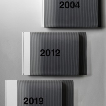
| DESIGN NAME: Utsuroi PRIMARY FUNCTION: Sake Packaging INSPIRATION: This product, limited to just 100 sets, aims to create a striking package that avoids classical styles and remains free from conventional constraints. It is designed to allow sake enthusiasts to focus on the tasting experience and fully enjoy a luxurious time for themselves. The package subtly communicates that it contains a set of sake from three different vintages. Despite keeping printing and processing costs low, the package maintains a significant presence suitable for gifting. These conditions, including the naming, were all carefully considered in the design. UNIQUE PROPERTIES / PROJECT DESCRIPTION: This set of three Daiginjo aged sake bottles features innovative slit animated packaging with changing logos to indicate the brewing years 2004, 2012, and 2019. Opening the box reflects the flow of time. The bottle seal highlights the progression of years using varnish and silver foil. The design emphasizes the amber color of sake, deepening with each vintage, adding a new layer of enjoyment to the sake experience. OPERATION / FLOW / INTERACTION: Using the principle of slit animation, opening the sleeve showcases the brewing years shifting from 2004 to 2012 and then to 2019. This conveys the concept of the passage of time from the moment the box is opened. The seals on the bottles represent the flow of time through the use of varnish and silver foil. The design eliminates decorations to emphasize the amber color of the sake, which becomes richer with each vintage. PROJECT DURATION AND LOCATION: This product was released on Friday, November 19, 2021, in a limited edition of 100 sets by Takeda Shuzo in Ogata, Joetsu City, Niigata Prefecture. FITS BEST INTO CATEGORY: Packaging Design |
PRODUCTION / REALIZATION TECHNOLOGY: Specifications: Double printed with black ink + OP varnish. Gift box: Double printed with black ink + OP varnish. Material: PP transparent 0.25. Gift box: CB 270g/EF (single-sided white, C5). SPECIFICATIONS / TECHNICAL PROPERTIES: Width 300 mm x Depth 232 mm x Height 64 mm TAGS: GraphicDesign, Utsuroi, PackageDesign, Branding, Sake, VintageSake, Katafune, Joetsu, Niigata, Japan RESEARCH ABSTRACT: This research explores innovative packaging that transcends traditional boundaries, enriching the sake experience. Slit animation symbolizes time's passage upon opening, with varnish and silver foil on bottle seals highlighting the amber beauty of vintages. Stripping away decorations, the design emphasizes sake’s intrinsic charm. By balancing costs with luxury, it delivers exclusivity, ideal for gifting and creating memorable moments. CHALLENGE: Achieving new concepts involved trial and error, applying slit animation to evoke the passage of time. Cost management balanced high-end design and budget limitations through careful material selection. The box design ensures ample white space and durability. Offset printing with double sumi ink achieved deep black sleeve animation. Bottle seal varnish highlights the vintage's amber beauty, fine-tuned for gloss. Packaging focuses on enriching the user’s luxurious sake experience. ADDED DATE: 2024-12-06 02:33:10 TEAM MEMBERS (1) : IMAGE CREDITS: Image #1: Maho Sekizuka, 2021. Image #2: Maho Sekizuka, 2021. Image #3: Maho Sekizuka, 2021. Image #4: Maho Sekizuka, 2021. Image #5: Maho Sekizuka, 2021. Video Credits: Maho Sekizuka, 2021. |
||||
| Visit the following page to learn more: https://mahosekizuka.jp | |||||
| AWARD DETAILS | |
 |
Utsuroi Sake Packaging by Maho Sekizuka is Winner in Packaging Design Category, 2024 - 2025.· Read the interview with designer Maho Sekizuka for design Utsuroi here.· Press Members: Login or Register to request an exclusive interview with Maho Sekizuka. · Click here to register inorder to view the profile and other works by Maho Sekizuka. |
| SOCIAL |
| + Add to Likes / Favorites | Send to My Email | Comment | Testimonials | View Press-Release | Press Kit |
Did you like Maho Sekizuka's Packaging Design?
You will most likely enjoy other award winning packaging design as well.
Click here to view more Award Winning Packaging Design.


