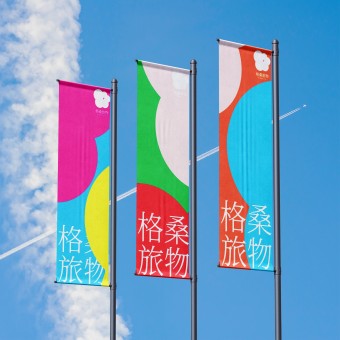
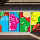
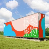
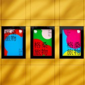
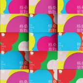
Ge Sang Lv Wu Corporate Logo by Xiaobing Cheng |
Home > Winners > #164842 |
| CLIENT/STUDIO/BRAND DETAILS | |
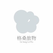 |
NAME: ge sang lv wu PROFILE: ge sang lv wu is a brand dedicated to sourcing the most pristine and pure resources from nature, focusing on bringing the gifts of the natural world to urban dwellers. We believe that nature is humanity's most precious treasure, and urban life should not be disconnected from its beauty. Therefore, Gelsang Travel Goods ventures into high mountains, forests, grasslands, and other pristine regions to carefully select high-quality natural products such as ingredients, tea leaves, coffee beans, and more, ensuring that each product retains the original flavors and health benefits of nature. Our product line is diverse, encompassing natural ingredients, high-mountain teas, premium coffee beans, and natural lifestyle products, all aimed at providing urban populations with healthy and pure lifestyle choices. Whether it's tea from high mountains, wild mushrooms from forests, or hand-roasted coffee beans, Gelsang Travel Goods hopes to help consumers experience the tranquility and beauty of nature amidst their busy urban lives. ge sang lv wu consistently adheres to sustainable development principles, emphasizing the protection of the natural environment and the responsible use of resources. Through our efforts, we aim not only to deliver high-quality natural products to consumers but also to promote a lifestyle that returns to and respects nature. ge sang lv wu—Bringing the purity of nature back to urban life. |
| AWARD DETAILS | |
 |
Ge Sang Lv Wu Corporate Logo by Xiaobing Cheng is Winner in Graphics, Illustration and Visual Communication Design Category, 2024 - 2025.· Read the interview with designer Xiaobing Cheng for design Ge Sang Lv Wu here.· Press Members: Login or Register to request an exclusive interview with Xiaobing Cheng. · Click here to register inorder to view the profile and other works by Xiaobing Cheng. |
| SOCIAL |
| + Add to Likes / Favorites | Send to My Email | Comment | Testimonials | View Press-Release | Press Kit |
Did you like Xiaobing Cheng's Graphic Design?
You will most likely enjoy other award winning graphic design as well.
Click here to view more Award Winning Graphic Design.


