Pacific Aquarium Rebranding by Mikayla Gao |
Home > Winners > #164272 |
 |
|
||||
| DESIGN DETAILS | |||||
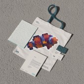
| DESIGN NAME: Pacific Aquarium PRIMARY FUNCTION: Rebranding INSPIRATION: The new identity serves as a “window,” embracing the ocean’s dynamic and inclusive nature while connecting visitors to the marine world. It reflects the aquarium’s mission to educate, engage, and promote ocean conservation. The open, adaptable design elements invite audiences to explore marine life, reinforcing the Pacific Aquarium’s role as an accessible gateway to learning about the ocean and its ecosystems. UNIQUE PROPERTIES / PROJECT DESCRIPTION: As Southern California’s largest aquarium, the Pacific Aquarium showcases best representing the Pacific Ocean’s rich diversity. The rebranding improved legibility and memorability and simplified the name to "The Pacific Aquarium." The design features fluid shapes and a custom font, evoking the ocean’s dynamic nature and reinforcing the aquarium’s mission of accessibility, education, and conservation through an adaptable, cohesive visual identity. OPERATION / FLOW / INTERACTION: The creation of a new identity for the Pacific Aquarium brings a more accessible and inclusive design, ensuring maximum impact on the institution’s mission. The fluid, modern design system is applied consistently across all physical and digital platforms, from exhibit signage to online content, making it easily recognizable to visitors. The customizable membership card system further enhances visitor interaction. This cohesive visual identity strengthens the connection between the aquarium and its audience, fostering recognition and engagement with educational and conservation initiatives. PROJECT DURATION AND LOCATION: This project was completed over 14 weeks, from September 15, 2023, to December 15, 2023, as part of my coursework at ArtCenter College of Design in Pasadena, California. FITS BEST INTO CATEGORY: Graphics, Illustration and Visual Communication Design |
PRODUCTION / REALIZATION TECHNOLOGY: The design was inspired by the fluidity of the ocean, and translated into a custom modular font. The exhibition typeface was developed using generative design techniques to create symbols reflecting the urgency of ocean conservation. The design was applied across various media, ensuring visual coherence from small-scale digital assets to large-scale physical installations, providing a consistent identity for the Pacific Aquarium. SPECIFICATIONS / TECHNICAL PROPERTIES: The new identity system is applied across all physical and digital touchpoints, including posters, signage, and stationery set. The identity also spans the aquarium’s desktop and mobile website, ensuring accessibility and fluid user experience across all platforms. The generative card tool provides members with customizable design options for their membership cards. TAGS: rebranding, brand identity, concept, institutional communication, graphic, logo, generative design, font design, ArtCenter College of Design RESEARCH ABSTRACT: I analyzed the branding of existing aquariums and conservation organizations by collecting visual data from their exhibits, signage, and digital platforms, and reviewing user feedback and engagement metrics to understand public perception. The research helped shape a design that fosters engagement, enhances the visitor experience, and encourages a deeper connection between the aquarium and the community. This adaptable identity improved branding while bridging the gap between design, education, and environmental awareness, creating a more engaging and effective experience for all audiences. CHALLENGE: The hardest part of this design activity was balancing the need for a modern, cohesive identity while preserving the educational and conservation values of the Pacific Aquarium. The challenge lay in creating a fluid, adaptable design that worked across various media platforms, from digital interfaces to large-scale exhibits. ADDED DATE: 2024-09-24 02:31:18 TEAM MEMBERS (1) : Mikayla Gao IMAGE CREDITS: Image #5: Should Wang, Tainan Art Museum, 2019, Unsplash. |
||||
| Visit the following page to learn more: https://mikaylagao.com | |||||
| AWARD DETAILS | |
 |
Pacific Aquarium Rebranding by Mikayla Gao is Winner in Graphics, Illustration and Visual Communication Design Category, 2024 - 2025.· Read the interview with designer Mikayla Gao for design Pacific Aquarium here.· Press Members: Login or Register to request an exclusive interview with Mikayla Gao. · Click here to register inorder to view the profile and other works by Mikayla Gao. |
| SOCIAL |
| + Add to Likes / Favorites | Send to My Email | Comment | Testimonials | View Press-Release | Press Kit |
Did you like Mikayla Gao's Graphic Design?
You will most likely enjoy other award winning graphic design as well.
Click here to view more Award Winning Graphic Design.


