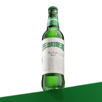
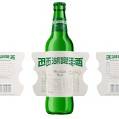
West Lake Beer Packaging by China Resources Snow Breweries |
Home > Winners > #163374 |
 |
|
||||
| DESIGN DETAILS | |||||
| DESIGN NAME: West Lake Beer PRIMARY FUNCTION: Packaging INSPIRATION: Inspired by the renowned natural and cultural landscape, West Lake in Hangzhou, the design elevates the cultural added value of the beer through the utilization of colors, patterns, and materials. The design team selected the West Lake sceneries, the Broken Bridge and Three Ponds Mirroring the Moon, and interpreted them into visual symbols abstractly and artistically. They were blended into every facet of the packaging, making it a medium for expressing the cultural connotation of West Lake. UNIQUE PROPERTIES / PROJECT DESCRIPTION: The packaging design of West Lake Beer incorporates cultural symbols and aesthetic features of West Lake, artistically interpreting elements such as Broken Bridge and Three Ponds Mirroring the Moon. It further blends typography and font design of Chinese aesthetics to create a packaging image that exudes classical flavour while maintaining a modern feeling. This design allows consumers not only to savour the beer but also to experience the charm of West Lake and its cultural significance. OPERATION / FLOW / INTERACTION: The Three Ponds Mirroring the Moon stone towers are designed to represent the varying intensities of the beer flavors on the bottle. This visual arrangement enhances the sensory exploration of taste and promotes social interaction among consumers during the savoring. The outer box is made of matte film with great texture, which offers a delicate tactile experience with jade like warmness and smoothness, further reflecting the cultural richness and high quality of the West Lake Beer brand. PROJECT DURATION AND LOCATION: The project was designed and developed in December 2022 in Beijing. FITS BEST INTO CATEGORY: Packaging Design |
PRODUCTION / REALIZATION TECHNOLOGY: The exterior box is crafted with a gold stamping process, enhancing its visual appeal and offering consumers a unique tactile experience. The bottle is constructed from high quality green glass, providing excellent optical protection that minimizes the potential for UV light to interact with beer compounds and cause odors or oxidation, preserving the freshness and flavor profile of the beer. SPECIFICATIONS / TECHNICAL PROPERTIES: product dimensions, 64.5 mm x 64.5 mm x 250 mm TAGS: Beer packaging, West Lake iconic elements, Seal script font, Song Dynasty calligraphy typography, Eastern aesthetics RESEARCH ABSTRACT: Through extensive research and excavation of West Lake culture, the design team has effectively translated the natural beauty and humanistic landscape of West Lake into visual elements incorporated into the beer packaging design. This process not only elevates the cultural and artistic value of the product but also serves as a valuable reference for the modernization and evolution of traditional beer brands. CHALLENGE: The challenge is capturing the cultural essence of West Lake. The West Lake Beer font mimics the graceful arch of the Broken Bridge, and some strokes resemble the soaring eaves of the mid lake pavilion, integrating West Lake aesthetics and seal script. The label is inspired by Song Dynasty calligraphy, from right to left, with a negative silhouette of Three Ponds Mirroring the Moon. Consumers can feel the profound Chinese aesthetics and the ethereal beauty of West Lake while enjoying the beer. ADDED DATE: 2024-07-17 03:02:36 TEAM MEMBERS (1) : Qiguang Li, Celine Zhou, Xiaowei He IMAGE CREDITS: China Resources Snow Breweries, 2024. |
||||
| Visit the following page to learn more: http://www.snowbeer.com.cn | |||||
| AWARD DETAILS | |
 |
West Lake Beer Packaging by China Resources Snow Breweries is Winner in Packaging Design Category, 2024 - 2025.· Read the interview with designer China Resources Snow Breweries for design West Lake Beer here.· Press Members: Login or Register to request an exclusive interview with China Resources Snow Breweries. · Click here to register inorder to view the profile and other works by China Resources Snow Breweries. |
| SOCIAL |
| + Add to Likes / Favorites | Send to My Email | Comment | Testimonials | View Press-Release | Press Kit |
Did you like China Resources Snow Breweries' Packaging Design?
You will most likely enjoy other award winning packaging design as well.
Click here to view more Award Winning Packaging Design.


