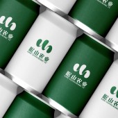
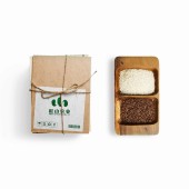
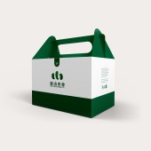
Min Shan Nong Ye Brand Identity by Yanjun Yang |
Home > Winners > #162623 |
| CLIENT/STUDIO/BRAND DETAILS | |
 |
NAME: Yanjun Yang PROFILE: Yanjun Yang is the founder of East Awaken Brand Design (Chengdu) Co., Ltd. With outstanding design talent and deep understanding of brand aesthetics, he has won numerous prizes in world's top design awards, including the gold medal of French Design Award (FDA) 2024, the gold medal of the US MUSE Creative Awards, and the gold medal of the American Good Design Award, which fully demonstrates his influence in the international design arena. Each of his works is a profound interpretation of the brand story, embodying the exploration of visual art. Through cooperation with multiple enterprises and institutions, Yanjun Yang has successfully shaped the brand image, and stimulated the brand's intrinsic value and market potential with the power of design, bringing far-reaching commercial impact. |
| AWARD DETAILS | |
 |
Min Shan Nong Ye Brand Identity by Yanjun Yang is Winner in Graphics, Illustration and Visual Communication Design Category, 2024 - 2025.· Read the interview with designer Yanjun Yang for design Min Shan Nong Ye here.· Press Members: Login or Register to request an exclusive interview with Yanjun Yang. · Click here to register inorder to view the profile and other works by Yanjun Yang. |
| SOCIAL |
| + Add to Likes / Favorites | Send to My Email | Comment | Testimonials | View Press-Release | Press Kit |
Did you like Yanjun Yang's Graphic Design?
You will most likely enjoy other award winning graphic design as well.
Click here to view more Award Winning Graphic Design.


