Hwg Campus Lu Wayfinding System by Thomas Geissert |
Home > Winners > #162366 |
 |
|
||||
| DESIGN DETAILS | |||||
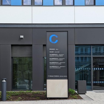
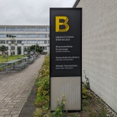
| DESIGN NAME: Hwg Campus Lu PRIMARY FUNCTION: Wayfinding System INSPIRATION: The aim was to create a system with its own identity and originality. Characterised by a modern, contemporary look with modern, classic typography. The calm appearance is intended to promote safety, confidence and deceleration among students. Contrasting modern design and a clear hierarchy of information characterise this new system. The orientation system is easy to use and makes a positive contribution to the quality of service on the campus. UNIQUE PROPERTIES / PROJECT DESCRIPTION: The aim in designing the new wayfinding system was to create a calm atmosphere and a balanced overall view without creating visual clutter. The choice of typography and icons, as well as the lighting and colour scheme, make it easier for international students to find their way around. The most important means, besides the use of the open Roboto typeface, is the introduction of high-contrast colours. Our focus was on functional and psychological aspects such as good visibility, readability and accessibility. OPERATION / FLOW / INTERACTION: The high contrast between the font colour and the background makes the information easy to read. Accessible information boards with tactile lettering have been developed for people with visual impairments. PROJECT DURATION AND LOCATION: The design process started in 2015 and the implementation of the signage elements was in 2024. The site is the campus of the University of Business and Society in Ludwigshafen, Germany. FITS BEST INTO CATEGORY: Graphics, Illustration and Visual Communication Design |
PRODUCTION / REALIZATION TECHNOLOGY: The signage system uses aluminium frames with a concrete base and aluminium panels with contemporary lettering. The logo was milled into the glass fibre reinforced concrete panels. The building numbers are decoupaged and highlighted in different colours. The numbers are illuminated at night. SPECIFICATIONS / TECHNICAL PROPERTIES: Various dimensions according to the neccessities on-site TAGS: modern, contemporary, reluctant, minimal, plain, timeless RESEARCH ABSTRACT: A signage system was designed to blend in with the surroundings without being overlooked. For this reason, colours and materials from the architecture and outdoor facilities were taken up, recombined and developed into an independent product. CHALLENGE: Processing and finishing the various materials was the biggest challenge. Laser cut aluminium, powder coated with high performance film, backlit coloured acrylic glass and engraved concrete panels were combined to form a single unit. ADDED DATE: 2024-06-17 09:21:12 TEAM MEMBERS (1) : Thomas Geissert IMAGE CREDITS: TEAMGEISSERT |
||||
| Visit the following page to learn more: https://bit.ly/3ZlgPLc | |||||
| AWARD DETAILS | |
 |
Hwg Campus Lu Wayfinding System by Thomas Geissert is Winner in Graphics, Illustration and Visual Communication Design Category, 2024 - 2025.· Read the interview with designer Thomas Geissert for design Hwg Campus Lu here.· Press Members: Login or Register to request an exclusive interview with Thomas Geissert. · Click here to register inorder to view the profile and other works by Thomas Geissert. |
| SOCIAL |
| + Add to Likes / Favorites | Send to My Email | Comment | Testimonials | View Press-Release | Press Kit |
Did you like Thomas Geissert's Graphic Design?
You will most likely enjoy other award winning graphic design as well.
Click here to view more Award Winning Graphic Design.


