Rebranding Emplus Identity Emplus by Ruud Winder - Rebrandt® |
Home > Winners > #160251 |
 |
|
||||
| DESIGN DETAILS | |||||
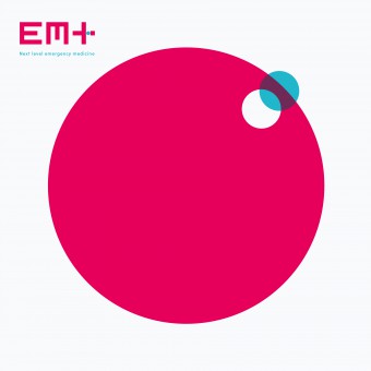
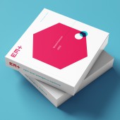
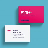
| DESIGN NAME: Rebranding Emplus PRIMARY FUNCTION: Identity Emplus INSPIRATION: Inspired by the visual language typically used in the medical world, the designer wanted to create new forms by abstracting the essence and delving deeper into simplicity. The combination of the red cross with a subtle aqua-colored dot creates a medical icon with the nuance of the 'missing piece' for which Emplus provides the training. UNIQUE PROPERTIES / PROJECT DESCRIPTION: The world around us is constantly changing, and so are the demands of the patients, and the way we provide healthcare. Emergency Medicine was always and will always be at the forefront of healthcare. Emplus offers training courses for Emergency Medicine professionals. The essence of the Emplus identity design is to captured the dynamics and visualizing that missing piece that makes the difference. The different forms are used alternately and increase the experience of the changing world and the dynamics of the profession. They symbolize the shifts in focus to the new situation. OPERATION / FLOW / INTERACTION: The different forms are used alternately and increase the experience of the changing world and the dynamics of the profession. They symbolize the shifts in focus to the new situation. PROJECT DURATION AND LOCATION: EMplus started in 2023 and will continue to grow the following years. FITS BEST INTO CATEGORY: Graphics, Illustration and Visual Communication Design |
PRODUCTION / REALIZATION TECHNOLOGY: Digital and paperwork SPECIFICATIONS / TECHNICAL PROPERTIES: European DIN sizes. TAGS: EMplus, design, Ruud winder, emergency medicine, courses, The Netherlands RESEARCH ABSTRACT: The creative team has made endless test series to arrive at the correct layout and the right size of the dots. CHALLENGE: Keep it as simple as possible, but still telling so much, that's a challenge! ADDED DATE: 2024-02-29 23:04:10 TEAM MEMBERS (5) : ruud winder - branding Architect and Designer, peter puntman - Motion Graphics , linda kaandorp — dtp, veronica stroomer — Microsoft documents and simone winder — assistent designer IMAGE CREDITS: All rights: Rebrandt / Ruud Winder 2024 PATENTS/COPYRIGHTS: All rights: Rebrandt / Ruud Winder 2024 |
||||
| Visit the following page to learn more: https://www.rebrandt.com/en/emplus | |||||
| AWARD DETAILS | |
 |
Rebranding Emplus Identity Emplus by Ruud Winder-Rebrandt® is Winner in Graphics, Illustration and Visual Communication Design Category, 2023 - 2024.· Read the interview with designer Ruud Winder - Rebrandt® for design Rebranding Emplus here.· Press Members: Login or Register to request an exclusive interview with Ruud Winder - Rebrandt®. · Click here to register inorder to view the profile and other works by Ruud Winder - Rebrandt®. |
| SOCIAL |
| + Add to Likes / Favorites | Send to My Email | Comment | Testimonials | View Press-Release | Press Kit |
Did you like Ruud Winder-Rebrandt®'s Graphic Design?
You will most likely enjoy other award winning graphic design as well.
Click here to view more Award Winning Graphic Design.


