Florist Wim Van Assem Rebranding by Rebrandt |
Home > Winners > #160086 |
 |
|
||||
| DESIGN DETAILS | |||||
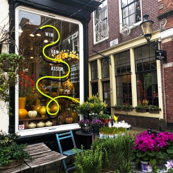
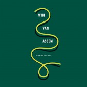
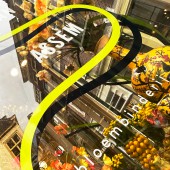
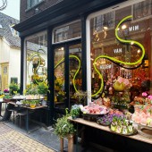
| DESIGN NAME: Florist Wim Van Assem PRIMARY FUNCTION: Rebranding INSPIRATION: With nature as the fundamental basis and dealing with it as a playground for creativity. The new identity was designed with the aim of conveying the joy and uninhibited expression of Wim van Assem's flower arranging. Inspired by the undisturbed energy and craftsmanship with which he continues to create unique combinations with flowers. UNIQUE PROPERTIES / PROJECT DESCRIPTION: Wim van Assem, one of the most progressive florists in North Holland, has significantly influenced Dutch floral art over the past 40 years with his unique style. For the designers the challenge was to develop a visual language for his 40th anniversary that matches his vibrant and uninhibited approach to flower arranging. The design, with eye-catching ribbons on the large windows of the historic building, instantly conveys the joy and free expression of his floral art. OPERATION / FLOW / INTERACTION: The unique and eye-catching line play combines modern typography and graphic design in a historical setting. PROJECT DURATION AND LOCATION: The designs can be seen at the old citycentre of Alkmaar, at Fnidsen, The Netherlands. FITS BEST INTO CATEGORY: Graphics, Illustration and Visual Communication Design |
PRODUCTION / REALIZATION TECHNOLOGY: Large, eye-catching lettering that had to be applied manually, featuring a dynamic shape that continues throughout, an old historical building, and a desired outcome of graphic, stylistic, and sleek visual language. Quite a challenge. SPECIFICATIONS / TECHNICAL PROPERTIES: 4 Shopping windows 150cm by 250cm TAGS: Wim van Assem, Rebrandt, rebranding, branding, flowers, florist, Alkmaar, Fnidsen RESEARCH ABSTRACT: The research focused on integrating modern design into historical contexts, aiming to bridge traditional aesthetics with contemporary graphic language. The objective was to understand how dynamic, eye-catching lettering could enhance an old building's charm while conveying the modern ethos of joy and creativity found in flower arranging. CHALLENGE: It was a challenge to keep it simple if you still want to convey a lot from the character and content of this famous florist. ADDED DATE: 2024-02-28 22:28:16 TEAM MEMBERS (3) : Ruud Winder - Brand Architect and Designer, Peter Puntman - Motion Graphics and GCA Reclame - Signing IMAGE CREDITS: Photography: Keesnan Dogger PATENTS/COPYRIGHTS: All rights Rebrandt 2024 |
||||
| Visit the following page to learn more: https://www.rebrandt.com/en/wimvanassem | |||||
| AWARD DETAILS | |
 |
Florist Wim Van Assem Rebranding by Rebrandt is Winner in Graphics, Illustration and Visual Communication Design Category, 2023 - 2024.· Read the interview with designer Rebrandt for design Florist Wim Van Assem here.· Press Members: Login or Register to request an exclusive interview with Rebrandt. · Click here to register inorder to view the profile and other works by Rebrandt. |
| SOCIAL |
| + Add to Likes / Favorites | Send to My Email | Comment | Testimonials | View Press-Release | Press Kit |
Did you like Rebrandt's Graphic Design?
You will most likely enjoy other award winning graphic design as well.
Click here to view more Award Winning Graphic Design.


