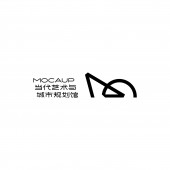
Mocaup Museum Brand by Tiger Pan |
Home > Winners > #152578 |
 |
|
||||
| DESIGN DETAILS | |||||
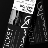
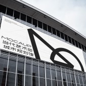
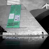
| DESIGN NAME: Mocaup PRIMARY FUNCTION: Museum Brand INSPIRATION: We want to create a core visual symbol, shaped by geometric lines to form an 'M', representing the open "art complex"nature of the two museums. This symbol incorporates and magnifies the design concept of the buildings, promoting their cultural and historical mission, and presents a space that is completely open for exploring public art. UNIQUE PROPERTIES / PROJECT DESCRIPTION: We hope to incorporate and amplify the design concept of the building itself through a core visual symbol, highlighting its cultural significance and historical mission. At the same time, it should possess avant-garde, artistic, and exploratory qualities, breaking the predefined definitions and boundaries of art in society. This will give the Two Museums more possibilities, making them a new artistic space that inspires creativity, fosters identity, and calls for action. OPERATION / FLOW / INTERACTION: The large-scale outdoor logo installation at the entrance of the exhibition center is expressed through white sculptural elements, which can be flat, folded, or three-dimensional. It interacts with the surrounding architectural elements, greenery, water features, and passers-by, creating a specific spatial domain that immerses visitors in an ambiance. Different perspectives provide observers with varying experiences, scales, distances, and viewpoints. PROJECT DURATION AND LOCATION: The project was fully completed in Shenzhen in January 2023. FITS BEST INTO CATEGORY: Graphics, Illustration and Visual Communication Design |
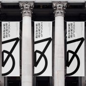
PRODUCTION / REALIZATION TECHNOLOGY: The letter 'M', representing MOCAUP, serves as a design element and continues the design language of the two museums designed by Coop Himmelblau: unpredictable volume relationships, changes within order, twists and undulations of form, and an element of randomness and uncertainty. Combining the philosophy of "two museums as one," it captures the façade of the Shenzhen museums with geometric lines drawn in one stroke. SPECIFICATIONS / TECHNICAL PROPERTIES: As the brand symbol of a large-scale exhibition center, the logo will appear in various contexts and scales, such as badges, posters, outdoor signage, etc. The art museum aims to connect everyone, fostering people's aspirations for art and their expectations for the city. The logo, as a core visual language, needs to have unique extensibility and compatibility to adapt to different scenarios and scales. The outdoor logo installation at the entrance of the exhibition center has dimensions of 12000mm x 2500mm. TAGS: Logo design, brand upgrade, exhibition center RESEARCH ABSTRACT: Public accessibility allows art museums to better connect with everyone and become a nexus of affection for the city. It fosters people's aspirations for art and their expectations for the city. Structure is not just the supporting framework of architecture; it also emphasizes integration with the building, achieving architectural space and expressing the power and elegance of the structure through visual symbols. CHALLENGE: The geometric lines forming this "M" line provide a connection point for people to love the city. The semi-enclosed structure corresponds to the positioning of the "Art Complex" with the two museums being open. The distinctive feature is that the contemporary art museum and urban planning museum, originally separate entities, are unified under the same architectural envelope, sharing some public service spaces and presenting a completely open space for exploring public art. ADDED DATE: 2023-06-26 06:34:38 TEAM MEMBERS (3) : Chief Designer: Tiger Pan, Designer: Chen Yiwen and Project Management: Peng Lei IMAGE CREDITS: Tiger Pan |
||||
| Visit the following page to learn more: https://www.behance.net/gallery/17211550 |
|||||
| AWARD DETAILS | |
 |
Mocaup Museum Brand by Tiger Pan is Winner in Graphics, Illustration and Visual Communication Design Category, 2023 - 2024.· Read the interview with designer Tiger Pan for design Mocaup here.· Press Members: Login or Register to request an exclusive interview with Tiger Pan. · Click here to register inorder to view the profile and other works by Tiger Pan. |
| SOCIAL |
| + Add to Likes / Favorites | Send to My Email | Comment | Testimonials | View Press-Release | Press Kit |
Did you like Tiger Pan's Graphic Design?
You will most likely enjoy other award winning graphic design as well.
Click here to view more Award Winning Graphic Design.


