Bolgrad Sparkling Wine by Valerii Sumilov |
Home > Winners > #151363 |
 |
|
||||
| DESIGN DETAILS | |||||
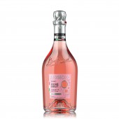
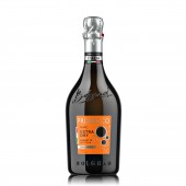
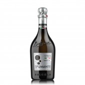
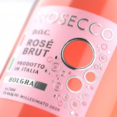
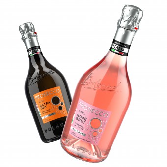
| DESIGN NAME: Bolgrad PRIMARY FUNCTION: Sparkling Wine INSPIRATION: What made this project special was the fact that we had to carefully transmit the spirit, atmosphere, and perception of real Italian sparkling wines while giving the consumer a clear understanding that they are dealing with a familiar brand. While working on the branding we always kept in mind that Italian sparkling wines are not just about style, breed, and brevity. They also have a mood, an atmosphere, that special passion, and sensation. This is what we tried to express in the design. UNIQUE PROPERTIES / PROJECT DESCRIPTION: The Bolgrad brand is expanding its product range, and its portfolio now includes a line of classic Italian sparkling wines. The sparkling wines are produced and bottled in Italy under the supervision of Bolgrad. We were tasked with the comprehensive branding of a collection of classic Italian sparkling wines. OPERATION / FLOW / INTERACTION: The label has unique elements that are cut through the label itself. When we glue the label to the bottle, we are able to see through the bottle through the cutouts that are formed. This gives additional visual value to the product and attracts the consumer's attention. PROJECT DURATION AND LOCATION: The project started in summer 2022 in Kiev, Ukraine. FITS BEST INTO CATEGORY: Packaging Design |
PRODUCTION / REALIZATION TECHNOLOGY: bottle design, brand concept development, trade mark design, package design. The use of advanced post-printing processes was thoughtfully planned out for the label. Their combination and use won't go unappreciated by the consumer. Paper: Fasson Orion Frozen Diamond Plus Post-print: silver stamping, embossing, tactile varnish SPECIFICATIONS / TECHNICAL PROPERTIES: Necklaces: 100 mm X 27 mm Label: 64 mm X 65 mm Paper: Fasson Orion Frozen Diamond Plus TAGS: italian, sparkling, wine RESEARCH ABSTRACT: We did market research on the competitive shelf. As a result of the research it became clear to us that Italian sparkling wines are not only about style, breed and brevity. But also mood, atmosphere, a special feeling and passion. That is what we tried to reflect in the design. CHALLENGE: The core idea revolves around the bubbles that are so pleasing on hot summer days. Reinforcing this idea, we took this image as the central one and made it an eye-stopper — the main, attention-grabbing element of the label. As a result, the label has a unique cut-out — three bubbles form a cut-through. Through the holes you can see the product itself. ADDED DATE: 2023-04-03 14:05:25 TEAM MEMBERS (3) : Creative & Design Director: Valerii Sumilov, Designer: Valerii Sumilov and Visualizer: Maxim Kulikov IMAGE CREDITS: Image #1 : Creator Valerii Sumilov / Visualizer Maxim Kulikov Image #2 : Creator Valerii Sumilov / Visualizer Maxim Kulikov Image #3 : Creator Valerii Sumilov / Visualizer Maxim Kulikov Image #4 : Creator Valerii Sumilov / Visualizer Maxim Kulikov Image #5 : Creator Valerii Sumilov / Visualizer Maxim Kulikov PATENTS/COPYRIGHTS: Copyright for all texts, images, designs, logo, website design www.shumilovedesign.eu belong to the company SC "SHLD GRUP" SRL. All rights reserved. © SHUMI LOVE DESIGN™, 2023 © VALERII SUMILOV, 2023 © SHLD GRUP SRL, 2023 |
||||
| Visit the following page to learn more: https://bit.ly/3KqSbRt | |||||
| AWARD DETAILS | |
 |
Bolgrad Sparkling Wine by Valerii Sumilov is Winner in Packaging Design Category, 2022 - 2023.· Read the interview with designer Valerii Sumilov for design Bolgrad here.· Press Members: Login or Register to request an exclusive interview with Valerii Sumilov. · Click here to register inorder to view the profile and other works by Valerii Sumilov. |
| SOCIAL |
| + Add to Likes / Favorites | Send to My Email | Comment | Testimonials | View Press-Release | Press Kit | Translations |
Did you like Valerii Sumilov's Packaging Design?
You will most likely enjoy other award winning packaging design as well.
Click here to view more Award Winning Packaging Design.


