DESIGN NAME:
The Box
PRIMARY FUNCTION:
Architecture
INSPIRATION:
THE BOX is surrounded by unspoiled countryside and endowed natural environment. Leveraging the architecture and space art, this design is intended to deliver a sense of city detachment from the peripheral countryside, and properly blend the living interactions of occupants into the interior space and natural environment. Looking for the connection between the living space and the natural environment.
UNIQUE PROPERTIES / PROJECT DESCRIPTION:
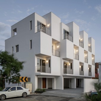
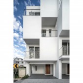
The open-wide greenery of the outer spaces seems to detach these pure white houses from the bustling metropolis. The architectural appearance constituted by an abstract geometric quadrilateral form blends into the background of the settlement. THE BOX is designed with inset and outset arrangement of physical and virtual squares, creating a microclimate in respect of physical space and vivid living imaginations. Simple actions surprisingly constitute the key characteristics of this design.
OPERATION / FLOW / INTERACTION:
This design attempts to treat eating with family as a critical part of maintaining the family bond. To make this happen, the dining and kitchen spaces are planned in the atrium space between the first floor and the second floor, a vertical space is thus formed with a view to spreading the inviting smell of meals and the cooking fun. Smell and hearing make floors no longer estranged, but an occasion to connect and talk with the family from time to time, which in turn shapes a vital life memory shared by family members. Going upstairs, you will see staggered floor slabs and the stairways leading to and from different floors leveraging the floor-to-floor angle to frame out the outdoor scenes, as if the outdoor natural scenery were a masterpiece on the white walls of the house. The absence of peripheral high-rise building frees up the limited way of window opening on the wall side. The ventilating raise is designed to the extent that the bathroom space attached to the master bedroom looks like a work by James Turrel. The sky, light and space are used as base materials to blur the bounds between the bathroom and the interior space. Without compromising the piracy, occupant can indulge in bathing and dressing under the sky light or the moonlight, as if it were a private space that turns the framed scenery into spatial art.
PROJECT DURATION AND LOCATION:
The project design was started from October 2020 and ended in May 2021
The project construction was started from June 2021 and ended in October 2022
FITS BEST INTO CATEGORY:
Architecture, Building and Structure Design
|
PRODUCTION / REALIZATION TECHNOLOGY:
Given the fact that THE BOX is geographically located in an earthquake-prone area, we use German KEIM 99% pure white mineral paint as the facade decoration material, which can prevent tiles and stone from shedding as a disaster hit. This material is also durable, easily cleaned and reflective to heat radiation.
SPECIFICATIONS / TECHNICAL PROPERTIES:
Construction area: 206.8m²
Number of layers: four layers
TAGS:
Nature, living, architecture, space, residence
RESEARCH ABSTRACT:
Considering the limited area available, we attempt to create a varied mix of spaces, and this is the story how The BOX originates. The physical and virtual white blocks on the facade open up the potentials of the interior space. The special composite wall structure diminishes the impact of the exposure to west sunlight on indoor space. The ventilating raise resembling chimney (windcatcher) allows for the physical air changing of the interior space. As a part of The BOX, staggered floor slabs redefine the floors in a way that not only partitions the zones, but also frames out the outdoor scenery. The ventilating raise on the top floor holds privacy uncompromised and blurs the bounds between the outdoor scenery and the bathroom space attached to the master bedroom, so that living interactions are infused as a part of the natural environment and the interior space.
CHALLENGE:
Due to the small size of each house, we tried out all possible solutions for space development with a view to finding a more interesting mix and sequence of spaces and conferring space meaning to this small house. The real and virtual rhythm is perceived dream-like and stylish. The geographical location causes the exposure to west sunlight and physical air changing even more prominent. As a countermeasure against the exposure to west sunlight, the west wall is made from the composite wall which is defined as an extra walling on the original walling (visually seen as white solid squares), the middle air layer can reduce the intensity of west sunlight and creates airflows; a ventilating raise disposed above the balcony can avoid the sunlight from being barred by the composite wall. In connection with physical ventilating, capitalizing on the ventilation and cooling technique that was anciently used in windcatcher, the temperature difference between the roof and the ground floor, coupled with the opening design, create the so-called “indoor chimney effect”, allowing vertical traffic air to flow from floor to floor. That’s how physical ventilation happens in interior space.
ADDED DATE:
2023-03-30 04:02:43
TEAM MEMBERS (1) :
IMAGE CREDITS:
Hsiang-Peng Chang, 2022.
|


