DESIGN NAME: Dragonpass
PRIMARY FUNCTION: Brand Identity
INSPIRATION: The original brand identity of DragonPass was a dragon emblem, which is an element of Eastern culture. As a global enterprise originating from China, DragonPass should have greater cultural inclusivity, and its brand image needs a more internationalized revamp.The design team, through co-creation with the company's management team, refined a new inspiring mission for DragonPass: "Going For New Aspirations." They also used the Magician archetype from the brand personality model as the basis for the brand image design.
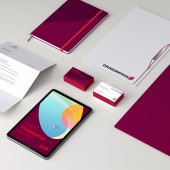
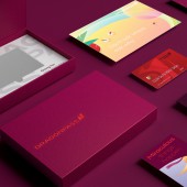
UNIQUE PROPERTIES / PROJECT DESCRIPTION: As the world second largest and the No.1 Asia-Pacific membership benefit solutions service provider, DragonPass has encountered a new strategic transformation opportunity. However, its image has become traditional and aging over the past 17 years, requiring a brand image upgrade.This case uses global vision, diversity, vitality, and humanism as keywords. By redesigning the brand's symbols and extending graphics, activating the brand colors, it redefines and standardizes the DragonPass brand visual system.
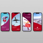
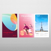
OPERATION / FLOW / INTERACTION: The new VI reduces complexity and returns to a simple appeal, making it easier to be recognized and disseminated in all scenarios. It aligns with the global urban aesthetic trend, helping shape an international and upscale brand image while interpreting the concepts and visions of DragonPass.The auxiliary graphics have strong visual impact, adaptability, and flexibility, which enhance the overall visual effects. They also carry symbolic meanings such as "active", "enjoy", and "cheerful", serving as expressions of the brand's attitude and emotions.
PROJECT DURATION AND LOCATION: The project began in Guangzhou in May 2022 and launched in Guangzhou in February 2023.
FITS BEST INTO CATEGORY: Graphics, Illustration and Visual Communication Design
|
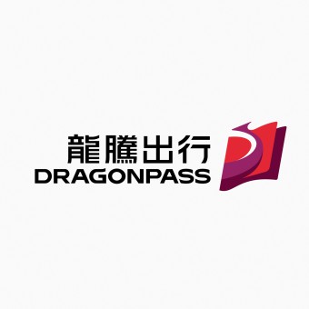
PRODUCTION / REALIZATION TECHNOLOGY: Based on the brand personality of Magician, the design team used the concept of magical wand trace and combined it with the initial letter "D" of DragonPass for the design. The new logo of DragonPass is dynamic, with magical wand trace crossing multiple dimensions, symbolizing that DragonPass will always bring surprises to it’s clients and users.In addition, the design team built upon the original red-dominated visual identity by adding elegant and fashionable colors like purple, making DragonPass even more attractive.
SPECIFICATIONS / TECHNICAL PROPERTIES: -
TAGS: VI reshape, travel, magician, color activation, interactivity
RESEARCH ABSTRACT: As a global intelligent travel service platform, DragonPass takes quality travel as the core, has built a member service system covering travel, health, living, entertainment and other lifestyle scenes. In the field of airport lounges providers, it has been ranked the first in Asia Pacific and the second in the world in the global service network.
CHALLENGE: The challenge in this case is to inherit and reshape the brand's original visual image, which must comply with the development of visual trends without completely deviating from the original impression. To achieve this, the design team refined and innovated elements based on DragonPass's original visual assets, aligning with the corporate culture and catering to popular aesthetic concepts. At the same time, they added a sense of freshness and appeal to the brand's visual image.
ADDED DATE: 2023-03-18 01:48:12
TEAM MEMBERS (1) :
IMAGE CREDITS: Mtc Brand Consultancy, 2022.
|