|
|
|

|
|
| DESIGN DETAILS |
DESIGN NAME:
Not Always Fun
PRIMARY FUNCTION:
Print Ad
INSPIRATION:
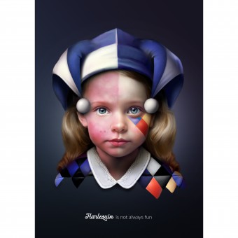
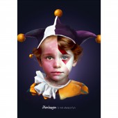
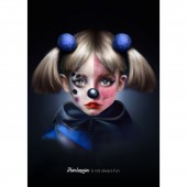
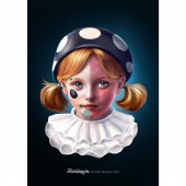
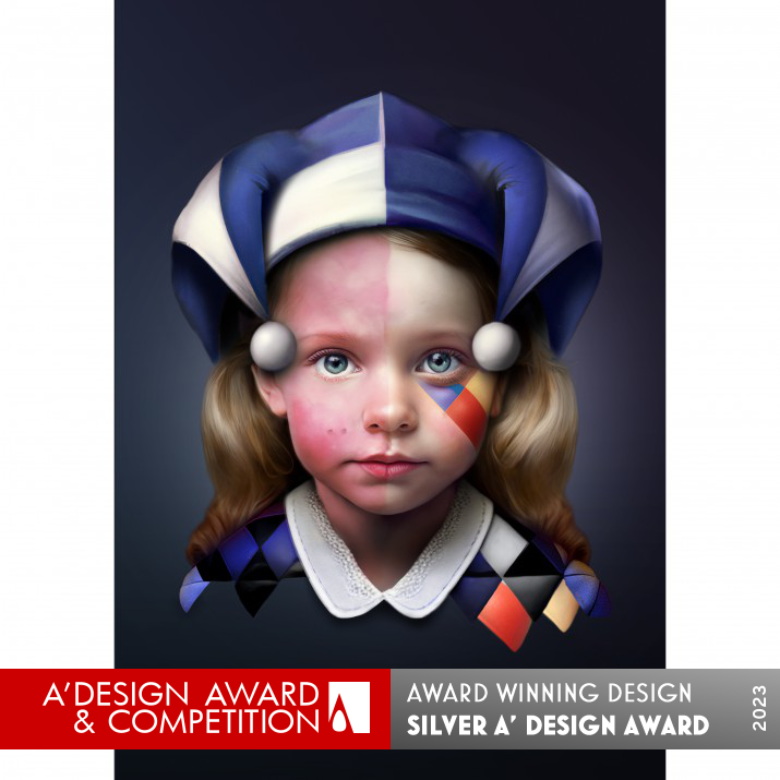
The key visual illustrations are based on the juxtaposition of the different representations of the word harlequin aiming to shed light on the disparity between the comical representation of the harlequin character and the reality of living with Harlequin syndrome, emphasizing the need for greater understanding and awareness of the condition.
UNIQUE PROPERTIES / PROJECT DESCRIPTION:
Harlequin syndrome is a syndrome affecting the autonomic nervous system and is associated with absence of sweating and flushing of skin on one side of the face. The key visual illustrations are based on the juxtaposition of the different representations of harlequin aiming to shed light on the disparity between the comical representation of the character and the reality of living with Harlequin syndrome, emphasizing the need for greater understanding and awareness of the condition.
OPERATION / FLOW / INTERACTION:
This is not relevant to the category presented.
PROJECT DURATION AND LOCATION:
The project was developed during the first trimester of 2023.
FITS BEST INTO CATEGORY:
Graphics, Illustration and Visual Communication Design
|
PRODUCTION / REALIZATION TECHNOLOGY:
Meticulously crafted illustration is all it is used to achieve the final result.
SPECIFICATIONS / TECHNICAL PROPERTIES:
This ad is used in print and digital media, ranging from 70 x 100 cm poster, to A4 print page and different sizes of banners.
TAGS:
craft, illustration, ad, social, craftsmanship, print, poster, design, art direction
RESEARCH ABSTRACT:
The main research that was held was about the Harlequin syndrome itself and how rare diseases are addressed.
CHALLENGE:
The creative is a juxtaposition of the two opposing sides of Harlequin - one is the light-hearted comical character and the other is the serious medical condition. To integrate those sides of the same character yet different characteristics and not ironize or victimize people suffering from the syndrome was the most difficult part.
ADDED DATE:
2023-03-14 18:40:48
TEAM MEMBERS (3) :
Creative Director - Yana Okoliyska, Copywriter - Dessislava Pavlova and
IMAGE CREDITS:
Creative Director Yana Okoliyska
Illustrator Yana Okoliyska
Copywriter Dessislava Pavlova
Agency Squared
|
|
| CLIENT/STUDIO/BRAND DETAILS |
 |
NAME:
SQUARED
PROFILE:
SQUARED is an award winning creative and production agency, based in Bulgaria. We work for brands and agencies providing them with
outstanding design solutions from initial concept to final delivery. From concept, through creation and production we create visual experiences that surpass expectations. But above all... We aim to make a difference.
|
|
|
| COMMENTS |
| Giulia Esposito |
Comment #96121 on June 20, 2023, 11:53 pm |
|
This is absolutely incredible! Seeing an award-winning design that communicates a social message is inspiring and encouraging. It's remarkable how a simple print ad can evoke such powerful emotions and create meaningful conversations about important topics. It's an amazing accomplishment and a testament to the designer's skill and creativity. Well done to Squared for this incredible design!
|
| Chloe Turner |
Comment #96694 on June 21, 2023, 3:04 am |
|
This work is truly stunning! The juxtaposition of the comical harlequin and the reality of living with Harlequin syndrome is an incredibly powerful visual and an important message to take away. It's amazing that such a seemingly simple concept can bring so much awareness to a condition that many people may not have known about before. Kudos to the designer for creating an impactful and meaningful piece that is sure to make a difference.
|
| Paul Phillips |
Comment #97006 on June 21, 2023, 4:48 am |
|
I'm in awe of the creativity and thoughtfulness behind this Print Ad. The designers have truly used the juxtaposition of the different representations of harlequin to draw attention to the reality of living with Harlequin syndrome, and to emphasize the need for greater understanding and awareness of the condition. The use of this unique design to highlight a serious medical condition is a great example of the power of social design to bring attention to important issues. Congratulations to Squared on their success in winning the A' Design Award!
|
| Elisabeth Clark |
Comment #97758 on June 21, 2023, 8:59 am |
|
It's so inspiring to see Squared's work win the A' Design Award for Social Design. Not Always Fun is an amazing piece of design and really captures the reality of living with Harlequin syndrome. It's incredible how Squared managed to juxtapose the comical representation of the character with the reality of the condition to emphasize the need for greater understanding and awareness. The research that Squared must have conducted to create this piece of work is truly commendable, and it's clear that Squared put a lot of time and effort into creating this meaningful and powerful print ad. It's a work of art and I'm so pleased to be able to celebrate its success!
|
| Adam Harris |
Comment #98275 on June 21, 2023, 11:52 am |
|
I am truly impressed by the creative work done by the designer with "Not Always Fun". The concept of juxtaposing two different representations of harlequin to create awareness about the Harlequin syndrome is both inspiring and thought-provoking. It is admirable that the designer was able to capture the complexity of the condition without coming across as either ironizing or victimizing people suffering from the syndrome. The research and challenges that the designer faced to create this award-winning work deserves a special recognition. Congratulations on the success of this amazing work!
|
| Paul Williams |
Comment #98551 on June 21, 2023, 1:24 pm |
|
What an incredible accomplishment! Not Always Fun is an incredibly powerful and thought provoking work that truly deserves its A' Social Design Award. The juxtaposition of the different representations of harlequin, from the comical to the serious, is a masterful way of shedding light on the disparity between the two. The meticulous craftsmanship behind the illustrations truly elevates this work to the next level, and really allows the viewer to understand the severity of the condition. It is amazing to see how Squared was able to integrate the two opposing sides of the same character while still maintaining the dignity of those living with Harlequin Syndrome. Well done!
|
| Mark Allen |
Comment #99243 on June 21, 2023, 5:15 pm |
|
This work is an exemplary example of social design, providing an emotionally-charged visual representation of the often overlooked reality of living with Harlequin syndrome. Through its juxtaposition of comical and serious elements, this work brings to light the need for greater understanding and awareness of the condition. The meticulous craftsmanship behind the illustrations is truly remarkable and deserving of this award. Congratulations!
|
| Elena Petrenko |
Comment #99565 on June 21, 2023, 7:02 pm |
|
This award-winning work is a powerful and meaningful visual representation that highlights the need for greater understanding and awareness of Harlequin syndrome.
|
|
|
Did you like Squared's Social Design?
You will most likely enjoy other award winning social design as well.
Click here to view more Award Winning Social Design.
Did you like Not Always Fun Print Ad? Help us create a global awareness for good social design worldwide. Show your support for Squared, the creator of great social design by gifting them a nomination ticket so that we could promote more of their great social design works.
|
|

|
|
|
|


