Sparrow Branding Corporate Identity by Hiroshi Kurisaki |
Home > Winners > #150366 |
 |
|
||||
| DESIGN DETAILS | |||||
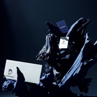
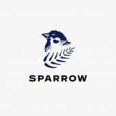
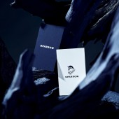
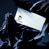
| DESIGN NAME: Sparrow Branding PRIMARY FUNCTION: Corporate Identity INSPIRATION: The idea comes from a story of a pine tree protecting a sparrow from all harm, which inspired the company’s founder.Hiroshi Kurisaki Design Inc was responsible for all visual images including logo, main visuals, and all stationaries. UNIQUE PROPERTIES / PROJECT DESCRIPTION: Hiroshi Kurisaki designed a brand identity for SPARROW, a Tokyo-based advertising production company founded in 2020. The design features a sparrow, the origin of the company’s name, with a pine tree as a symbol tree. The idea comes from a story of a pine tree protecting a sparrow from all harm, which inspired the company’s founder. It represents a wish that this new company will be protected against difficulties and steadily move forward. OPERATION / FLOW / INTERACTION: Instead of CG or synthesis, the actual pine trees selected by the flower arrangement artist and the realistic model of the sparrow give the scene a sense of realism. PROJECT DURATION AND LOCATION: The project started in Tokyo in the summer of 2021 and took about two months from sketching to shooting. FITS BEST INTO CATEGORY: Graphics, Illustration and Visual Communication Design |
PRODUCTION / REALIZATION TECHNOLOGY: In order to put together a set of characteristic pine trees, we had a flower arrangement artist come in and put together an art set to create a unique world view. SPECIFICATIONS / TECHNICAL PROPERTIES: Since the main visual was announced on the website, it is based on 1980 x 1080px. It was also printed on paper as an A3 size output. TAGS: Branding, Logo, Japan, Typography, Blue RESEARCH ABSTRACT: Research began with understanding the story of the brand's founding. After that, focusing on the sparrow, we analyzed various photos of the sparrow, examined whether it was better to include only the face or the whole body, and verified the appearance of the pose more specifically, and further visualized through sketches. it was done. CHALLENGE: By using the sparrow as the main visual, it explored a tone that doesn't look too cute. Since the company takes on more challenges, design tone aimed for a strong and serious tone that conveys our challenge. ADDED DATE: 2023-03-03 13:31:23 TEAM MEMBERS (1) : IMAGE CREDITS: Photo By Bird And Insect Ltd. |
||||
| Visit the following page to learn more: https://www.sprw.co.jp/ | |||||
| AWARD DETAILS | |
 |
Sparrow Branding Corporate Identity by Hiroshi Kurisaki is Winner in Graphics, Illustration and Visual Communication Design Category, 2022 - 2023.· Read the interview with designer Hiroshi Kurisaki for design Sparrow Branding here.· Press Members: Login or Register to request an exclusive interview with Hiroshi Kurisaki. · Click here to register inorder to view the profile and other works by Hiroshi Kurisaki. |
| SOCIAL |
| + Add to Likes / Favorites | Send to My Email | Comment | Testimonials | View Press-Release | Press Kit |
Did you like Hiroshi Kurisaki's Graphic Design?
You will most likely enjoy other award winning graphic design as well.
Click here to view more Award Winning Graphic Design.


