DESIGN NAME:
Miga
PRIMARY FUNCTION:
Brand Design
INSPIRATION:
E-cigarette is an innovative electronic consumer product with ever-increasing accessibility around the world. Because consumers are now more conscious about health and well-being, the FMCG product E-cigarette is required to win the favor of consumers which is considered the key to opening up the E-cigarette market. To stand out from the homogeneous market competition, a new brand identity is conferred to MIGA, and we also make a connection between logo and intended elements.
UNIQUE PROPERTIES / PROJECT DESCRIPTION:
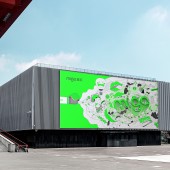
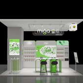
MIGA is a brand offering better aesthetic value, fun, portability, intelligence and affordability to smokers, with a view to bringing pleasure to users and enhancing their experience of life attitude. The updated version of brand identity design optimizes the typeface design and makes logo more unified, delivers an intuitive brand impression to user, refreshes and diversifies the perceived feelings.
OPERATION / FLOW / INTERACTION:
The new brand identity is an ensemble of super symbols, and the smile logo signifies the perceived pleasure and stimulates interaction with the brand. The vector logo serves many purposes which can be used on light or dark backgrounds, or suits the needs of brand marketing in various forms.
PROJECT DURATION AND LOCATION:
-
FITS BEST INTO CATEGORY:
Graphics, Illustration and Visual Communication Design
|
PRODUCTION / REALIZATION TECHNOLOGY:
The updated version of brand identity design optimizes the typeface design and makes logo more unified. For the English font, the stroke ratio and corner angle are adjusted to make the overall visual elements more filled, cause the logo and the smile symbol more relevant, highlight the profile of melon vines, and increase the visual proportion of the smile symbol. For the Chinese font, strokes are designed in conjunction with super symbols, the spacing between strokes is regulated, the characters are round in shape and perceived as a better design, and the whole character pattern structure is retained, making the typeface design more recognized. The whole set of typeface design reconciles visual language in respect of stroke profile.
SPECIFICATIONS / TECHNICAL PROPERTIES:
It can be typewritten or printed on any size and material.
TAGS:
Visual identity, Typeface, Brand design, E-Cigarette, Logo design, MIGA, Corporate identity, Typesetting
RESEARCH ABSTRACT:
Youths in small towns and the new generation of consumers growing up in the context of consumption upgrading and internet access are lively, bold and prefer taking challenges and trying new stuffs. This package is designed to represent the appearance in a more innovative, bold and recreational way, leaving a deeper impression on consumers. MIGA’s package is well-positioned to stand out of the homogeneous competition in the E-cigarette market.
CHALLENGE:
The key point of this design is to create a simple and modern logo which is intended to transmit more information. The Chinese name of MIGA is a concrete object that is made a part of the brand logo design, mediocre or unduly complex form would not convey the spirit of the brand. After subsequent research and study, we personalize and upgrade the brand according to the specific needs, giving it a distinctive and final identity.
ADDED DATE:
2023-02-28 02:47:37
TEAM MEMBERS (2) :
Li Xue and Today Design
IMAGE CREDITS:
Xue Li, 2022.
|


