To Beauty Skincare Brand by Yuta Takahashi |
Home > Winners > #149520 |
 |
|
||||
| DESIGN DETAILS | |||||
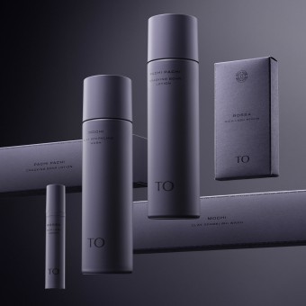
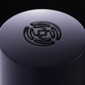
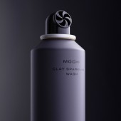
| DESIGN NAME: To Beauty PRIMARY FUNCTION: Skincare Brand INSPIRATION: People are subject to mental exhaustion due to our modern stressful society. Individualistic values have isolated our spirits, forcing us to live in a state of mind like walking on a tightrope. We wanted to build a brand inspired by the cosmic oneness that comes from spiritual and meditative experiences to bring deep healing to people, just as the sun and moon shine on us as equals, just as Mother Earth nurtures us. UNIQUE PROPERTIES / PROJECT DESCRIPTION: TO is a skincare brand with the concept of "awakening to nature's rhythm". It presents a unique and unprecedented vision. A mystical colorpalette, organic symbology that expresses the pulse of life, and a mystical presence. It offers a luxurious and meditative experience akin to that of a high-end spa. A screw nozzle with a unique design, a hygienic, preservative-free, airless container. The brand offers a profound healing experience. OPERATION / FLOW / INTERACTION: The specially structured screw nozzle of the facial cleanser ejects an ideal dense foam with a single push, which maintains elasticity for a long time and reduces skin irritation from friction. The eyelash beauty serum uses an innovative airless container that is preservative-free and hygienic. Even the fitting inside the cap, which normally receives little attention, is beautifully designed in a crescent shape to enhance the brand. PROJECT DURATION AND LOCATION: It started in Nagoya in October 2020 and finished in April 2022. The brand was announced at Beauty World Japan in Tokyo in May 2022. |
PRODUCTION / REALIZATION TECHNOLOGY: We created Shade Gray, our signature brand palette, through more than 200 color matching runs and more than 50 physical samples of materials of varying textures, including aluminum, plastic, paper, and fabric. The caps for the facial cleanser and skin toner are double-layered with a hard ABS exterior and soft PP interior for improved texture and fit, with a grained surface and foil stamping with an engraved symbol on top. SPECIFICATIONS / TECHNICAL PROPERTIES: Spray (MOCHI, PACHI PACHI) W: 50mm x D: 50mm x H: 195mm Spray box W: 205mm x D: 51mm x H: 51mm Dozen boxes W: 320mm x D: 110mm x H: 262.5mm Airless container (BOSSA) W: 19.5mm x D: 19.5mm x H: 103mm Airless container box W: 53mm x D: 21.5mm x H: 106mm Merchandise display W: 307mm x D: 106mm x H: 23mm Mortar with large bubbles, reminiscent of the surface of the moon, was cut out and sealed with acrylic sheets that were processed to resemble glass. The symbol and logo are laser engraved on all four sides. TAGS: skincare, mysterious, branding, packaging, product, japan RESEARCH ABSTRACT: We looked at the development of human behavior and culture from a sociological perspective and sought to find the cultural impulses needed for the future. Modern people suffer from mental exhaustion and isolation. We saw a need for a skincare brand with a new vision to fill the void deep healing through oneness from meditative experiences. Through these reflections, a distinctive identity for a skincare brand was born, inspired by the spirit's mystical, cosmic, and meditative experiences. CHALLENGE: We explored Anthroposophie to understand the meditative and cosmic consciousness. We discussed how the planets interlock as one to nurture us. We looked at the life force that interlocks the universe and created a symbol that would represent this dynamic, organic life force. Inspired by the cosmos, Shade Gray resides quietly and is a companion any anyone's lifestyle. We constructed and designed a high quality and consistent vision for the brand. ADDED DATE: 2023-02-27 04:41:13 TEAM MEMBERS (1) : IMAGE CREDITS: Image 1: Photographer Yuta Takahashi, 2023 Optional Image 1: Photographer Yuta Takahashi, 2023 Optional Image 2: Photographer Yuta Takahashi, 2023 Optional Image 3: Photographer Yuta Takahashi, 2023 Optional Image 4: Photographer Yuta Takahashi, 2023 |
||||
| Visit the following page to learn more: http://to-official.jp | |||||
| AWARD DETAILS | |
 |
To Beauty Skincare Brand by Yuta Takahashi is Winner in Graphics, Illustration and Visual Communication Design Category, 2022 - 2023.· Read the interview with designer Yuta Takahashi for design To Beauty here.· Press Members: Login or Register to request an exclusive interview with Yuta Takahashi. · Click here to register inorder to view the profile and other works by Yuta Takahashi. |
| SOCIAL |
| + Add to Likes / Favorites | Send to My Email | Comment | Testimonials | View Press-Release | Press Kit |
Did you like Yuta Takahashi's Graphic Design?
You will most likely enjoy other award winning graphic design as well.
Click here to view more Award Winning Graphic Design.


