Allowonce Mobile App Concept by Hyunah Oh |
Home > Winners > #149329 |
 |
|
||||
| DESIGN DETAILS | |||||
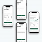
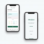
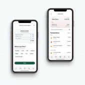
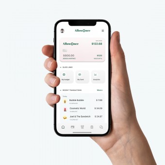
| DESIGN NAME: Allowonce PRIMARY FUNCTION: Mobile App Concept INSPIRATION: The idea of Allowonce came from user interviews. Allowonce is essentially a creative mashup of the different types of apps that users mentioned that they were using. Allowonce provides automated budgeting and spending tracking by combining the usability of credit cards, the interactivity of mobile apps, and active communication, an all-in-one virtual allowance card that eliminates the need to juggle between budgeting and banking apps. UNIQUE PROPERTIES / PROJECT DESCRIPTION: This app concept was designed to help young adults manage, plan, and limit spending in one go, on a virtual allowance card. By using this Allowonce card, users can easily limit and track their spending. OPERATION / FLOW / INTERACTION: The main flow shows all core functionalities of the app concept, which include budgeting, spending, and tracking : how a user might put in their income, expenses and financial goal(s) to (1) obtain automatically calculated budget, (2) issue an AllowOnce card for the month, (3) spend money from the card, and (4) record their spending. PROJECT DURATION AND LOCATION: This app concept started in May and was finished in August 2022, as a capstone project for BrainStation's UX Design Bootcamp. Even after the project was finished, user testing and iterations continued. FITS BEST INTO CATEGORY: Interface, Interaction and User Experience Design |
PRODUCTION / REALIZATION TECHNOLOGY: Prototyping - Figma / Mock-ups - Adobe Photoshop / User research & testing - Slack, Zoom, Google Forms SPECIFICATIONS / TECHNICAL PROPERTIES: Mobile app concept intended for iOS devices. (screen size : 390 x 844 px, optimized for iPhone 13 Pro) TAGS: Finance, credit card, banking, mobile, saving, spending, budgeting, young RESEARCH ABSTRACT: < User interviews > Objective : uncover user pain points in using existing market solutions Methodology : Zoom call, 1 hour each, 5 users within age 18-35 Results : Key pain points were identified < Usability testing > Objective : test usability & validity of solution Methodology : Slack huddle, 20 min each, 2 rounds with 10 users within age 18-35 Results : validity of solution was confirmed, task flow was extended. < A/B testing > Objective : quickly test user preference of certain screens Methodology : Google Forms, 8 users within age 18-35 Results : 3 screens were redesigned CHALLENGE: The most challenging part was to come up with the right solution idea that incorporates various user pain points identified during the user interview process. Users had different issues : some pointed to budgeting, while others mentioned difficulties of recording spending, and still other users complained about the inaccurate, untimely statements. I had to come up with a solution that encompasses and balances all those needs in one seamless flow, and that was the most challenging part of this project. ADDED DATE: 2023-02-25 16:01:46 TEAM MEMBERS (1) : IMAGE CREDITS: N/A |
||||
| Visit the following page to learn more: http://hyunahoh.com | |||||
| AWARD DETAILS | |
 |
Allowonce Mobile App Concept by Hyunah Oh is Winner in Mobile Technologies, Applications and Software Design Category, 2022 - 2023.· Read the interview with designer Hyunah Oh for design Allowonce here.· Press Members: Login or Register to request an exclusive interview with Hyunah Oh. · Click here to register inorder to view the profile and other works by Hyunah Oh. |
| SOCIAL |
| + Add to Likes / Favorites | Send to My Email | Comment | Testimonials | View Press-Release | Press Kit | Translations |
Did you like Hyunah Oh's Mobile Design?
You will most likely enjoy other award winning mobile design as well.
Click here to view more Award Winning Mobile Design.


