Evoluwe Branding Project by Jonathan Andrade |
Home > Winners > #149212 |
 |
|
||||
| DESIGN DETAILS | |||||
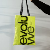
| DESIGN NAME: Evoluwe PRIMARY FUNCTION: Branding Project INSPIRATION: To convey the idea of continuous and collaborative evolution, the symbol design for the consulting firm utilized the company's initials "E" and "W" in a distinctive manner, along with three essential moments that define their consulting process. The letter "E" signifies evolution, denoting growth, transformation, and development. The inclusion of the word "we" underscores a shared evolution, one in which progress is made together. UNIQUE PROPERTIES / PROJECT DESCRIPTION: The Evoluwe branding project was created for a customer service consulting firm, but what sets it apart is that it was developed from inception to completion with active participation from both the company's owner and its clients. This means that the project carries the company's brand purpose and essence right from its initial stages, which turns even more special. OPERATION / FLOW / INTERACTION: The brand essence portrays an entrepreneurial woman in the consulting industry, a field lacking a passionate professional company in the founder's locality. Evoluwe aims to simplify the process while sparking the curiosity of local businessmen and women about agile methodologies and co-creation. Clients are involved in decision-making and creative processes from the initial contact, becoming key collaborators in their business's evolution. PROJECT DURATION AND LOCATION: The project started in December 2021 in Brazil and finished in April 2022 in Brazil. FITS BEST INTO CATEGORY: Graphics, Illustration and Visual Communication Design |
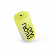
PRODUCTION / REALIZATION TECHNOLOGY: To ensure the new brand name aligned with the target audience's expectations, I conducted a survey among the founder's primary clients. Data collection was a crucial step in the validation process. The brand creation process followed the golden ratio methodology, which ensured consistency across digital and physical materials while enhancing the brand's visibility and integrity. SPECIFICATIONS / TECHNICAL PROPERTIES: Width 5 mm x Depth 87 mm x Height 150 mm The packaging's hexagonal shape was inspired by the logo's geometric design concept. The symbol's creation influenced the package's shape. The printed material features a soft touch matte lamination finish, with 300g matte coated paper. TAGS: Experience, Improve, Transformation, Evolution, Evolve, Elevate, Elevate, We Evolve, We Evolve Together, Evolve Together RESEARCH ABSTRACT: The company aims to establish itself as a provider of innovative and reliable customer service solutions. The survey aims to gather feedback on the name, including its appeal, memorability, and associations with the brand's mission and values. To achieve this goal, we conducted an online survey among a sample of 20 individuals. The results showed that the name "Evoluwe" is generally well-received by the participants. 76% of the participants found the name appealing, while 80% of the participants found the name memorable. The survey results provided valuable insights into the perceptions and associations that the name "Evoluwe" elicits. The most common associations with the name were innovation, growth, and evolution, which align with the brand's mission and values. CHALLENGE: The hardest part was creating the naming. In the process there were some difficulties with other naming options. However, everything was overcome with naming research and collaboration on the project with the owner and her clients. In the end, having a solid name that represented the company in its essence, made my inspiration flow. ADDED DATE: 2023-02-24 16:32:10 TEAM MEMBERS (1) : IMAGE CREDITS: Jonathan Andrade, 2022. |
||||
| Visit the following page to learn more: http://bit.ly/3GpZ03d | |||||
| AWARD DETAILS | |
 |
Evoluwe Branding Project by Jonathan Andrade is Winner in Graphics, Illustration and Visual Communication Design Category, 2022 - 2023.· Read the interview with designer Jonathan Andrade for design Evoluwe here.· Press Members: Login or Register to request an exclusive interview with Jonathan Andrade. · Click here to register inorder to view the profile and other works by Jonathan Andrade. |
| SOCIAL |
| + Add to Likes / Favorites | Send to My Email | Comment | Testimonials | View Press-Release | Press Kit |
Did you like Jonathan Andrade's Graphic Design?
You will most likely enjoy other award winning graphic design as well.
Click here to view more Award Winning Graphic Design.


