Modulabs Identity System by Wonseon Yu and Yoonhee Jeong |
Home > Winners > #148300 |
 |
|
||||
| DESIGN DETAILS | |||||
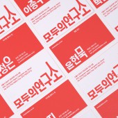
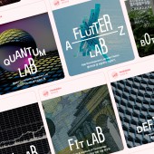
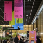
| DESIGN NAME: Modulabs PRIMARY FUNCTION: Identity System INSPIRATION: Modulabs is a research community that fosters growth, co-prosperity, and challenge. Its visual identity reflects its values, which include innovation, experimentation, and learning. Modulabs believes that everyone can make a difference and encourages its passionate community to pursue their goals. The new identity system aims to inspire and empower members to take bold steps towards realizing their true potential. UNIQUE PROPERTIES / PROJECT DESCRIPTION: Modulabs' visual identity system embodies the values of growth, co-prosperity, and challenge. The "Next step forward tomorrow" rule inspires continuous progress and limitless potential. Co-prosperity is emphasized through the collaborative nature of the new typeface, creating a cultural fit within the community. The unique shape of the typeface reflects the value of challenge, encouraging risk-taking and exploration of new frontiers. The visual identity system at Modulabs represents a commitment to creating a culture of innovation and learning, driving positive change for the future. OPERATION / FLOW / INTERACTION: Since the whole system is realized with the dedicated typeface, members of Modulabs can easily align with the identity's tone by using the typeface. We also integrated some internal tools to create names of community members with ease for those who are not designers. PROJECT DURATION AND LOCATION: The project started in September 2022 in Seoul and finished in November 2022. The rebranding process had to be swift and straightforward because only two graphic designers were working for the whole company. FITS BEST INTO CATEGORY: Graphics, Illustration and Visual Communication Design |
PRODUCTION / REALIZATION TECHNOLOGY: The identity system is built with a dedicated variable typeface. It has a single "Growth" axis, which has 300 steps to express all kinds of different shapes while growing experience. Each letter is carefully drawn to give a humanistic vibe instead of generating shapes geometrically. We intentionally avoided geometric shapes to give a more humanistic vibe rather than giving too much systematic look. The letters are designed to be wobbly at first sight to show that the community is not about making perfect results but more about action and adventure. SPECIFICATIONS / TECHNICAL PROPERTIES: - TAGS: Identity, Typeface, System RESEARCH ABSTRACT: We recognized the need for a visual identity that reflects our community's values. Extensive research, including surveys and interviews, helped us understand our members. We identified our core values and mission and translated them into keywords that guided our new identity system. Mood boards helped us experiment with different looks, resulting in a design that reflects our unique philosophies. Our thoughtful approach created a visual identity that fosters innovation and learning, truly representing our community. CHALLENGE: Developing Modulabs' new visual identity was challenging, as we had to persuade the community to embrace a logo without a symbol. We showed examples of how the system could be used extensively and created a jingle to demonstrate its versatility. Our commitment to transparency and inclusivity helped us create a visual identity that represents our values in a dynamic and adaptable way. The result fosters a culture of innovation and learning, and our community is proud to embrace the new visual identity system. ADDED DATE: 2023-02-13 02:44:00 TEAM MEMBERS (2) : Creative Director: Wonseon Yu and Designer: Yoonhee Jeong IMAGE CREDITS: Wonseon Yu and Yoonhee Jeong, 2022. PATENTS/COPYRIGHTS: trademarks: Modulabs (2023) |
||||
| Visit the following page to learn more: https://modulabs.co.kr/ | |||||
| AWARD DETAILS | |
 |
Modulabs Identity System by Wonseon Yu and Yoonhee Jeong is Winner in Graphics, Illustration and Visual Communication Design Category, 2022 - 2023.· Read the interview with designer Wonseon Yu and Yoonhee Jeong for design Modulabs here.· Press Members: Login or Register to request an exclusive interview with Wonseon Yu and Yoonhee Jeong. · Click here to register inorder to view the profile and other works by Wonseon Yu and Yoonhee Jeong. |
| SOCIAL |
| + Add to Likes / Favorites | Send to My Email | Comment | Testimonials | View Press-Release | Press Kit |
Did you like Wonseon Yu and Yoonhee Jeong's Graphic Design?
You will most likely enjoy other award winning graphic design as well.
Click here to view more Award Winning Graphic Design.


