Oil Street Art Space Visual Identity by Kimhung Choi and Thomas Siu |
Home > Winners > #148151 |
 |
|
||||
| DESIGN DETAILS | |||||
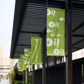
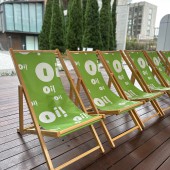
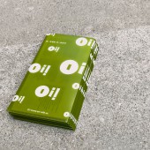
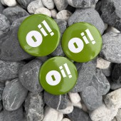
| DESIGN NAME: Oil Street Art Space PRIMARY FUNCTION: Visual Identity INSPIRATION: The 'Oi!' project aims to develop a visual identity that reflects the brand's core ideas. The name itself replaces the 'L' with an exclamation mark which serves as a call for people's attention and a visual representation of the project's location. The logo's shape is designed to illustrate the idea of calling out loud for attention in graphic form. The use of green as the identity colour suggests that 'Oi!' is an oasis for the arts in the midst of the urban jungle of concrete and steel. UNIQUE PROPERTIES / PROJECT DESCRIPTION: “Oi!”- Oil Street Art Space, is housed in the former clubhouse of the Royal Hong Kong Yacht Club. It opens to the public as community leisure and cultural space in two phases after revitalisation and restoration, including a red-bricked Grade II historic building with a tile roof and over 3000 sqm outdoor area with a two-storey building incorporating an exhibition and multipurpose venue respectively. OPERATION / FLOW / INTERACTION: The visual identity conveys a welcoming and unifying ambience to all visitors and to deliver the message that it is a platform where the people can realise their dreams in art and igniting their creative spark. PROJECT DURATION AND LOCATION: May 2022, The Hong Kong SAR FITS BEST INTO CATEGORY: Graphics, Illustration and Visual Communication Design |
PRODUCTION / REALIZATION TECHNOLOGY: The visual identity of ‘Oi!’ aims to create distinctive and memorable brand that capture the essence of the project. The applications on environmental graphics and collateral to provide guidance to visitors to explore all parts of Oi! and to enhance the impression of Oi! to the public. SPECIFICATIONS / TECHNICAL PROPERTIES: Various dimensions according to the visual identity application from buntings to pinned badges TAGS: Branding, Visual Identity, Logo, Signage, Environmental Design, Art and Cultural Space RESEARCH ABSTRACT: Given that part of the premises is Grade II historic building, a range of research on historical premise transforming to public usage and old architecture revamp projects were conducted. After reviewing different angles, the client and designers would like to portray the brand image with Oi!’s vision and mission and to make art relevant in the community. Finally, we chose to use the name as the core element on the logo which also helps the audience to remember where it is located. CHALLENGE: - ADDED DATE: 2023-02-09 04:10:34 TEAM MEMBERS (3) : Client: Art Promotion Office, The Hong Kong SAR, Designer: Kimhung Choi, Thomas Siu and IMAGE CREDITS: Kimhung Choi and Thomas Siu, 2022. |
||||
| Visit the following page to learn more: https://kimhungdesign.com/ | |||||
| AWARD DETAILS | |
 |
Oil Street Art Space Visual Identity by Kimhung Choi and Thomas Siu is Winner in Graphics, Illustration and Visual Communication Design Category, 2022 - 2023.· Read the interview with designer Kimhung Choi and Thomas Siu for design Oil Street Art Space here.· Press Members: Login or Register to request an exclusive interview with Kimhung Choi and Thomas Siu. · Click here to register inorder to view the profile and other works by Kimhung Choi and Thomas Siu. |
| SOCIAL |
| + Add to Likes / Favorites | Send to My Email | Comment | Testimonials | View Press-Release | Press Kit |
Did you like Kimhung Choi and Thomas Siu's Graphic Design?
You will most likely enjoy other award winning graphic design as well.
Click here to view more Award Winning Graphic Design.


