DESIGN NAME:
The Dark Side of the Moon
PRIMARY FUNCTION:
Love Letter
INSPIRATION:
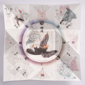
In this uncommissioned project we have combined our love for print design, story telling, illustration, graphic design and materials. The goal was to tell a story without the traditional form of a book. On the letter is space for a personal massage, this story can/should be shared with someone and reconnect those old stories with modern life again. The letter itself is folded like a 'pocket purse' - a Japanese Folding technique popular in Europe in the 18th century for writing love letters.
UNIQUE PROPERTIES / PROJECT DESCRIPTION:
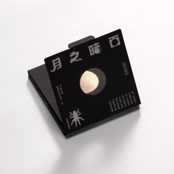
The 'Dark Side of the Moon' is a love letter, telling a traditional Chinese love story, not only with words, but also by the way the package is opend, by the choice of printing technology, the used materials, the graphic design and illustrations. The storytelling begins as soon as the package is opened: the full moon on the front wanes, the dark side of the moon becomes visible. The story unfolds together with the unfolding of the letter, guiding the reader from chapter to chapter.
OPERATION / FLOW / INTERACTION:
Telling stories is as old as humanity. Love stories are especially popular. Giving presents to your loved ones is today more a requirement rather than an act of showing love. So we thought about a way to reintegrate old love stories with the rather old tradition of writing love letters. So this design is a present, where personal messages can be added while at the same time it is a documentation of an old love story using new design.
PROJECT DURATION AND LOCATION:
started August in Hangzhou and finished November in Hangzhou
|
PRODUCTION / REALIZATION TECHNOLOGY:
Since the letter is folded paper, the paper needs to have the property to be folded and unfolded multiple times without being torn apart, so we chose a kind of DuPond paper, which can't be ripped apart and which is translucent - two attributes love should have. Since The Love Story is about the sun and the moon, the letter also has a sun and a moon side. The translucency of the paper makes the two sides of the letter flow together when held up against the sun. If you hold the letter down while reading, you cannot see the other side.
SPECIFICATIONS / TECHNICAL PROPERTIES:
Folded with package: 12 * 12cm
Unfolded letter : 36 * 36cm
TAGS:
graphic design, illustration, print, type design, package design
RESEARCH ABSTRACT:
As a Chinese/ German design studio, we are interested in finding a way of melting those different cultures in a project. The tradition of writing love letters is not that popular in China, throughout its history. So we came up with the idea of a Chinese love letter, using a folding method which also made its way from East to West. The story of Houyi and Chang'e is over 2000 years old and has many versions, but all have an outdated moral. So we rewrote the story first, before we started with the layout. From the beginning we planned this love letters to be a series, so we choose a package which has a CD feeling, since still many of people collect or collected CDs. Like love letters CDs seem from another century, but we think of them in loving nostalgia and hope to revive them in a new way with our design.
CHALLENGE:
Since we are a package design studio, we have an interest in paper. Commercial projects for clients often don't give the opportunity to use more special papers and printing techniques. When visiting package factories we can discover new papers and think about ways to use it and combine materials with stories through design. The used 'pocket purse' folding method, which originated in Japan, but became popular in 18th century Europe as love letter folding method, needed special paper. It made the layout and choice of paper challenging, but also became the designs key component. Since it's not only a creative design project, but also an actual product we sell it was difficult to find a producer who was fit for this folding method.
ADDED DATE:
2023-01-29 07:56:45
TEAM MEMBERS (1) :
IMAGE CREDITS:
Qianli Ma, Maria-Luisa Uth
|


