
|
|
| DESIGN DETAILS |
DESIGN NAME:
Aprex Family
PRIMARY FUNCTION:
Typeface Specimen
INSPIRATION:
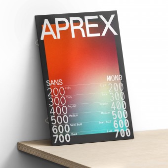
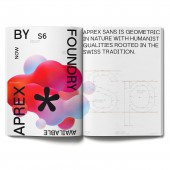
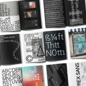
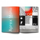
Aprex Sans draws inspiration from the mid-century humanist and grotesques typefaces, and its solid and straightforward structure is characterized by angular connections between curves and stems. Aprex Mono is a Monospaced stylized industrial version, with multilingual support. The font is inspired by a basic sans serif glyphs structure, concerning the balance and optimization that bring a clean typeface.
UNIQUE PROPERTIES / PROJECT DESCRIPTION:
Aprex font perfectly balances the minimalist qualities associated with contemporary sans with flair within the width of the counters and comfortable, breathable apertures. — Throughout weights and sizes, the typeface has great legibility and good contrast between positive and negative space, making it stunningly versatile. With a seamless combination of contemporary details and classic styles, Aprex draws inspiration from the mid-century humanist and grotesques typefaces.
OPERATION / FLOW / INTERACTION:
-
PROJECT DURATION AND LOCATION:
The Ffont family was developed in 2022
FITS BEST INTO CATEGORY:
Graphics, Illustration and Visual Communication Design
|
PRODUCTION / REALIZATION TECHNOLOGY:
The font was firstly hand drawn and then developed within Glyphs.
SPECIFICATIONS / TECHNICAL PROPERTIES:
The font famlity is available in TTF, OTF, and WOFF formats.
TAGS:
Font design, Branding, Identity, Type design, Type Specimen
RESEARCH ABSTRACT:
Research and development was based on the International style of the late 20th century, drawing inspiration from the mid-century humanist and grotesques typefaces, and its solid and straightforward structure is characterized by angular connections between curves and stems.
CHALLENGE:
The hardest part was to create a mono and sans serif font that retailed detail and form.
ADDED DATE:
2023-01-23 08:16:13
TEAM MEMBERS (1) :
Paul Henry Robb
IMAGE CREDITS:
Images and typeface copyright Paul Henry Robb 2022
PATENTS/COPYRIGHTS:
Copyrights belong to Paul Henry Robb, 2022.
|
| Visit the following page to learn more: https://www.fontshop.com/families/aprex-sans |
|
| COMMENTS |
| Giulia Esposito |
Comment #95857 on June 20, 2023, 10:25 pm |
|
I am absolutely delighted to see that this creative work has been recognized and rewarded with the A' Design Award. The "Aprex Family" Typeface Specimen is a remarkable example of artful visual communication that is sure to inspire many in the design community. It is truly a work of art that demonstrates a high level of skill, imagination and dedication. I am highly impressed by the intricate details and the sheer beauty of this work. It is a pleasure to see a piece of work that is so deserving of this award. Congratulations to Paul Robb for this extraordinary accomplishment.
|
| Chloe Turner |
Comment #96487 on June 21, 2023, 1:55 am |
|
I'm in awe of the Aprex Family typeface specimen! It's a stunning example of modern typeface design, taking classic mid-century typefaces and giving them a contemporary spin. The angular connections between curves and stems bring an unmistakable character to the font, and the monospaced industrial version is simply wonderful. It's clear to see why this typeface specimen has been awarded an A' Design Award, and I can't wait to see what else Paul Robb will come up with in the future!
|
| Paul Phillips |
Comment #96895 on June 21, 2023, 4:11 am |
|
I'm thrilled to have seen the Aprex Family typeface specimen that has just won the A' Design Award! The minimalistic qualities of the design are perfectly balanced with a comfortable and breathable feel. It is incredibly versatile, with great legibility and contrast between the positive and negative space, all while drawing inspiration from classic typefaces. I am very impressed by this work and congratulate Paul Robb for their success in winning the award!
|
| Thomas Anderson |
Comment #97071 on June 21, 2023, 5:10 am |
|
I'm absolutely in love with Aprex Family! Its ability to balance minimalist qualities associated with contemporary sans with the necessary flair within its counters and apertures is truly remarkable. It is incredibly legible and has such good contrast between positive and negative space, making it incredibly versatile. The seamless combination of contemporary details and classic styles is something I deeply admire. It captures the essence of mid-century humanist and grotesques typefaces in a modern and stylish way. Its solid and straightforward structure is characterized by angular connections between curves and stems and Aprex Mono is a perfect example of this. All in all, this typeface is a masterpiece and a true testament to the designer's skill and talent.
|
| Elisabeth Clark |
Comment #97521 on June 21, 2023, 7:40 am |
|
I am delighted to have come across Paul Robb's Aprex Family typeface specimen. It is a truly beautiful work of art – a perfect balance between minimalist contemporary design and classic styles. The legibility and contrast between positive and negative space is simply stunning, making it incredibly versatile. The research and development behind this work is commendable, drawing inspiration from the mid-century humanist and grotesques typefaces. I'm so thrilled to see Paul Robb receive the A' Design Award for this wonderful work. Aprex Family is a true showcase of excellent design that will be sure to last for years to come.
|
| Adam Harris |
Comment #98094 on June 21, 2023, 10:51 am |
|
This award-winning work of "Aprex Family" is an extraordinary example of modern design. The typography specimen is ingeniously crafted to balance the minimalist qualities with tasteful flair. The legibility and contrast between positive and negative space is remarkable, making it a stunningly versatile typeface. It is amazing how the combination of contemporary and classic styles come together to create this unique and captivating typography. The research and development that went into creating a mono and sans serif font that retained detail and form is truly impressive. This award-winning work is a true testament to modern design.
|
| Paul Williams |
Comment #98454 on June 21, 2023, 12:51 pm |
|
Aprex Family is an exceptional work that truly deserves to be celebrated. Its unique combination of classic and contemporary styles has been expertly crafted to provide a typeface that is both visually stunning and incredibly versatile. With its great legibility, perfect balance and comfortable apertures, it is easy to see why this typeface has been honored with the A' Design Award. Its solid and straightforward structure make it the perfect choice for any design project and its multilingual support make it a great option for any global audience. The research and development that went into the creation of this typeface is clearly evident and the hard work that went into the hand-drawing and optimization is commendable. Aprex Family is a true testament to the power of good design.
|
| Victoria Hill |
Comment #98606 on June 21, 2023, 1:42 pm |
|
Aprex Family is a truly remarkable work, capturing the perfect balance between contemporary style and classic aesthetics in a stunningly versatile font. Paul Robb has crafted a typeface with great legibility and contrast between positive and negative space, combining minimalist qualities with flair and comfort. The hard work and dedication that went into the research and development of this typeface is clear, as evidenced in its solid and straightforward structure and angular connections between curves and stems. The monospaced stylised industrial version of Aprex with multilingual support is sure to impress, with its inspiration from basic sans serif glyphs and the attention to detail and form. It is no surprise that Aprex Family has won the Platinum A' Design Award in Graphics, Illustration and Visual Communication Design Category.
|
| Mark Allen |
Comment #99013 on June 21, 2023, 3:58 pm |
|
This work is an impressive example of the perfect balance between minimalist modernism and traditional typeface designs. With a seamless combination of contemporary details and classic styles, this typeface specimen combines legibility and contrast between positive and negative space to create a stunningly versatile work. The research and development of this piece was based on the International style of the late 20th century, making it a truly unique work of art. The hard work to create a mono and sans serif font that retained detail and form is evident in this award-winning work.
|
| Elena Petrenko |
Comment #99454 on June 21, 2023, 6:25 pm |
|
Aprex Family is an impressive typeface specimen that beautifully combines contemporary details with classic styles.
|
| Valentina Rossi |
Comment #99620 on June 21, 2023, 7:20 pm |
|
Aprex Family is a truly outstanding work of great design, a perfect balance of minimalist qualities and classic style. The font is stunningly versatile and has excellent legibility and good contrast between positive and negative space.
|
| Patricia Miller |
Comment #99706 on June 21, 2023, 7:49 pm |
|
Aprex Family is an outstanding example of good design that perfectly balances minimalist qualities with classic styles, providing great legibility and contrast between positive and negative space.
|
| Hien Nguyen |
Comment #99795 on June 21, 2023, 8:19 pm |
|
I am amazed by the creative excellence of Paul Robb's work titled "Aprex Family". It is an outstanding achievement and a true testament to Paul's talent and skill in the field of graphics, illustration and visual communication design.
|
|
|
