DESIGN NAME: Tea and Tea
PRIMARY FUNCTION: Branding
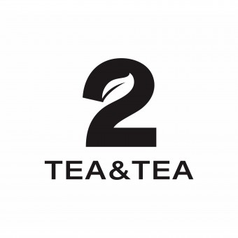
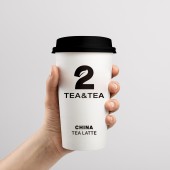
INSPIRATION: The logo consists of the lettering “Tea and Tea” and the Arabic numeral “2”, which dominates the trademark and has a distinctive appearance due to the integration of a stylized tea leaf. In combination with a clear, eye-catching color scheme and a straightforward stylistic idiom that informs.The brand updated the logo from the store front and space decoration, tea culture hall and other space displays. The product packaging has been newly upgraded to create a new brand temperament.
UNIQUE PROPERTIES / PROJECT DESCRIPTION: Tea and Tea is a Chinese drink brand whose marketing strategy centers around Chinese tea latte. The logo consists of the lettering "Tea and Tea" and the Arabic numeral "2", which dominates the trademark and has a distinctive appearance due to the integration of a tea leaf. In combination with a clear, eye-catching color scheme and a straightforward stylistic idiom that informs, for instance, the packaging design and retail displays, Tea and Tea’s visual appearance achieves high brand recognition.
OPERATION / FLOW / INTERACTION: In 2018, the first Tea and Tea in China was officially opened. Nowadays, there are many kinds of beverages in the beverage market. Tea and Tea is committed to original and innovative products, providing consumers with more and different choices, which reflects the product value of Tea and Tea. Chinese Tea Latte: Divide the market and define the competition category.
Our star product line: tea + latte, shows that our business scope is different from similar brands in the market, and meets the consumption needs of caffeine-free refreshing and oil scraping.
PROJECT DURATION AND LOCATION: The brand started in 2021 in Shenzhen, China. Currently there are seven stores in Shenzhen and three stores in Shanghai.
FITS BEST INTO CATEGORY: Graphics, Illustration and Visual Communication Design
|
PRODUCTION / REALIZATION TECHNOLOGY: Apply the logo to all extensions. Let the logo become a super symbol, improve consumers' awareness of the brand.Packaging uses colorful colors to distinguish tea categories, so that the whole brand young.Through the upgrade of the brand image, the quality of the Tea & Tea brand has been improved.
SPECIFICATIONS / TECHNICAL PROPERTIES: -
TAGS: Branding, Tea, Latte, Graphic design, Package, Logo, Identity
RESEARCH ABSTRACT: We always need to be clear, to understand the order of things, the focus and the purpose. Alert us to the motto that all things serve the ultimate purpose. Implement this method into each planning and design link. This is the asset of the brand, the name, symbol, product and the whole of the brand. Keep all creative work centered around the brand's core assets: symbols, reasons to buy, and products.
CHALLENGE: We began to face what symbol to choose as the logo of “Tea and Tea”. What symbols are internationalized symbols? What are the symbols that everybody knows. When we thought about that, the brand design was successful.
ADDED DATE: 2022-12-08 06:46:10
TEAM MEMBERS (1) : Shenzhen Huathink Liu Yongqing Brand Design
IMAGE CREDITS: Image: Shenzhen Huathink Liu Yongqing Brand Design
|