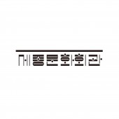
Sejong Center Rebranding Identity Renewal by Won Rak |
Home > Winners > #146646 |
 |
|
||||
| DESIGN DETAILS | |||||
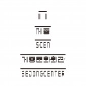
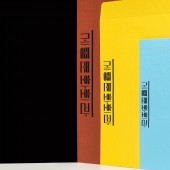
| DESIGN NAME: Sejong Center Rebranding PRIMARY FUNCTION: Identity Renewal INSPIRATION: Sejong Center combines Sejong, Culture, and Center in Korean. Sejong means sky, culture means people, and brown means land. This was applied to the design based on the philosophical logic of King Sejong, which was used to create Hangul. This is because it already used the name Sejong to honor King Sejong. In addition, it was combined with music scores around six pillars of the building to become a logo that can be played for a short time. UNIQUE PROPERTIES / PROJECT DESCRIPTION: Sejong Center for the Performing Arts is an old public institution that opened in Seoul in 1978. What is special about this identity design is that it tried to break away from the existing logo design of Korean public institutions. These attempts are a new combination of old and recent, and Hangul itself serves as a symbol. In particular, the use of Hangul as a logo is a boldness that is rarely seen in Korea, and it is appealing to the younger generation as a new retro. OPERATION / FLOW / INTERACTION: This design is not only a good example of the branding of Korean public institutions, but also enough to promote the uniqueness of Korean concert halls to the world. Unlike private companies, existing public institutions must be passive in branding because they must be easily accessible to the general public. However, if a new branding design is presented to the public first as an institution that provides culture and arts, it can be expected to improve the cultural level of society as a whole. PROJECT DURATION AND LOCATION: The project started in March 2021 and finished in August 2021, and was released in February 2022 at the Sejong Center for the Performing Arts in Gwanghwamun, Seoul, South Korea. FITS BEST INTO CATEGORY: Graphics, Illustration and Visual Communication Design |
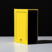
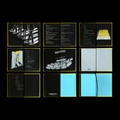
PRODUCTION / REALIZATION TECHNOLOGY: The existing branding methodology for public institutions is divided into two in South Korea. First, a combination of symbols and readable but accessible words. Second, it is a way to use English only. Both were avoided and experimented with constantly to utilize the system and structure of Hangul. A very efficient branding template was created by expanding the form of consonants completed by combining Korean typography, and the guide's rules are apparent. SPECIFICATIONS / TECHNICAL PROPERTIES: - TAGS: K-design, Sejong center, Rebranding, identity design, ShinShin, Type tailor, Hangul, Theatre Design, Korea logotype, Typography RESEARCH ABSTRACT: Beyond simple logo redesign, various branding works have been carried out. First, customized typefaces were produced for future use, and costumes that overcame the difficulties of stage officials were also produced. In addition, a fairy tale book containing the stories of workers working silently behind the theater was created to organize contents other than the performance. It is meaningful to try various design forms with various senses of the image of this public institution. CHALLENGE: At least in Korea, it is no exaggeration to say that the market for public institutions throughout the design industry, such as graphics and branding design, is the tomb of designers. In particular, designing logos using Hangul does not give a sophisticated impression to the Korean public. However, the Sejong Center for the Performing Arts set a precedent for achieving sufficient artistic and exemplary results through improvement of business procedures and dedication of the person in charge. ADDED DATE: 2022-11-29 02:27:12 TEAM MEMBERS (18) : Identity Design: ShinShin (Haeok Shin, Donghyeok Shin), Typeface Design: Type Tailor (Heejae Yang, Sooyoung Jang), Motion Graphic: Junguk Byun, Book Design: ShinShin (Haeok Shin, Donghyeok Shin), Book Illustration: Etoffe (Nayoung Lee), Book Playwright: Jeongeun Hwang, Fashion Design: Halominium (Yumi Lee), Photography: Studio Dosi (Shinyoung Park, Kyuho Shim), Fashion Film: Studio Dosi (Shinyoung Park, Kyuho Shim), Project Executive Team Leader: Kyunga Moon, Seokkyung Kim, Art Director: Rak Won, Brand Manager: Yujin Bae, Jaeeun Kwon, Byunghun Choi, Fashion PM: Hyejin Jee, Publication PM: Youngji Kang, Web PM: Youngji Kang, Hyejung Lee, Identity Application Design: Gyeongsu Kim, Yongjin Kim, MD Design: Gyeongsu Kim, Yongjin Kim and Branding Story Documentary Film: Jeonga Yoo, Jeonghun Kim, Seowoo Kim IMAGE CREDITS: Won Rak, 2022. PATENTS/COPYRIGHTS: Copyright (C) Sejong Center for the Performing Arts. All rights reserved. |
||||
| Visit the following page to learn more: http://sejongpac.or.kr | |||||
| AWARD DETAILS | |
 |
Sejong Center Rebranding Identity Renewal by Won Rak is Winner in Graphics, Illustration and Visual Communication Design Category, 2022 - 2023.· Read the interview with designer Won Rak for design Sejong Center Rebranding here.· Press Members: Login or Register to request an exclusive interview with Won Rak. · Click here to register inorder to view the profile and other works by Won Rak. |
| SOCIAL |
| + Add to Likes / Favorites | Send to My Email | Comment | Testimonials | View Press-Release | Press Kit |
Did you like Won Rak's Graphic Design?
You will most likely enjoy other award winning graphic design as well.
Click here to view more Award Winning Graphic Design.


