Taichung Public Library Brand Identity by Yichun Lin |
Home > Winners > #145496 |
 |
|
||||
| DESIGN DETAILS | |||||
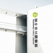
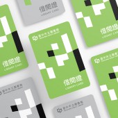
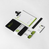
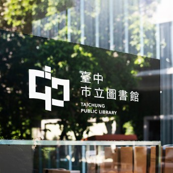
| DESIGN NAME: Taichung Public Library PRIMARY FUNCTION: Brand Identity INSPIRATION: The design was inspired by the concept of "Library in the Park, Art Museum in the Forest". The brand system focuses on the fusion of "nature" and "civilization&q UNIQUE PROPERTIES / PROJECT DESCRIPTION: The designer uses graphics in blocks as the primary design element, incorporating books and the Chinese character "Chung", and aligning with the building's square design. The Logo's undulating pattern suggests flexibility, like diving into an ocean of books. Green represents nature and growth, fitting with the Library's mission. Meanwhile, the black block provides visual contrast and suggests stability and authority, reflecting the Library's role as a reliable source of knowledge. OPERATION / FLOW / INTERACTION: The wordmark can be customized and used as exterior signage, depending on the branch name. The Logo can be applied to the library merchandise. With the extension of the graphic units and color palette, identification can be present on various products and official documents with the system. PROJECT DURATION AND LOCATION: December 2020 to January 2021, Taiwan FITS BEST INTO CATEGORY: Graphics, Illustration and Visual Communication Design |
PRODUCTION / REALIZATION TECHNOLOGY: All the graphics were created and designed with Adobe Illustrator and Photoshop. SPECIFICATIONS / TECHNICAL PROPERTIES: Minimum size of logo: 35mm x 6.5mm TAGS: Visual Identity, Logo, Branding, Graphics, Printed Matter RESEARCH ABSTRACT: The black block is strategically placed on the upper side of the Logo, where the Library's position is relative to the park. The Chinese wordmark is set in Noto Sans, while the English wordmark uses Avenir. To ensure visual consistency and alignment with the Logo, the designer modified the proportion and details of the wordmark. The block-shaped graphic element is carefully integrated with the library building's square design, emphasizing the relationship between the brand and its physical space. CHALLENGE: As the Library's anticipated opening is still several years away in 2025, the designer faces the challenge of limited information to inform the design process. This lack of data poses significant difficulties and requires the designer to think creatively and imaginatively to craft a design that accurately captures the essence and identity of the Library. Additionally, the designer must remain adaptable to any changes that may arise in the intervening years, ensuring that the final design remains relevant and effective upon the Library's opening. ADDED DATE: 2022-09-30 06:28:23 TEAM MEMBERS (1) : Art Director: Yichun Lin IMAGE CREDITS: Photographer Keith Camiller, 2017 Photographer Ryunosuke Kikuno, 2020 Photographer Gabriel Sollmann, 2018 Photographer Aarón Blanco Tejedor, 2017 |
||||
| Visit the following page to learn more: https://tinyurl.com/2f95th6d | |||||
| AWARD DETAILS | |
 |
Taichung Public Library Brand Identity by Yichun Lin is Winner in Graphics, Illustration and Visual Communication Design Category, 2022 - 2023.· Read the interview with designer Yichun Lin for design Taichung Public Library here.· Press Members: Login or Register to request an exclusive interview with Yichun Lin. · Click here to register inorder to view the profile and other works by Yichun Lin. |
| SOCIAL |
| + Add to Likes / Favorites | Send to My Email | Comment | Testimonials | View Press-Release | Press Kit | Translations |
Did you like Yichun Lin's Graphic Design?
You will most likely enjoy other award winning graphic design as well.
Click here to view more Award Winning Graphic Design.


