A Inc Corporate Identity by Yu Morisawa |
Home > Winners > #145279 |
 |
|
||||
| DESIGN DETAILS | |||||
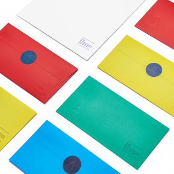
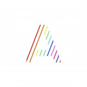
| DESIGN NAME: A Inc PRIMARY FUNCTION: Corporate Identity INSPIRATION: Using a single A in the logo creates a sense of presence that embodies A Inc's vision illuminating people's potential and mission for a world that believes in the power of what people like. The meanings invested in the logo are 1.Stripes signify the energy and potential of everyone involved with A Inc. 2. The A is an accumulation of multiple stripes. 3. A Inc takes shape through the power of its diversity of preferences. UNIQUE PROPERTIES / PROJECT DESCRIPTION: I handled the corporate design for A Inc. The limitless energy and potential of every A Inc employee is expressed using a range of colors. The striped pattern for the letter A of the logo is a visual expression of how the company is formed by an overlapping combination of all those individuals. OPERATION / FLOW / INTERACTION: Understanding of identity Company motivation Visualization of company image recruiting PROJECT DURATION AND LOCATION: Completed in Tokyo in 2020. Since then, we have continued to refine it. FITS BEST INTO CATEGORY: Graphics, Illustration and Visual Communication Design |
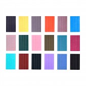
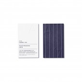
PRODUCTION / REALIZATION TECHNOLOGY: In applying the design, people can choose their favorite color for business cards and multiple envelope colors can be matched with recipients. The colors have a strong emphasis, so the logo is embossed for subtlety. SPECIFICATIONS / TECHNICAL PROPERTIES: Business card Width91mm, Height55mm Envelope Width235mm, Height120mm TAGS: limitless energy, potential, a range of colors, stripes, diversity RESEARCH ABSTRACT: I try to keep things simple, clear, and emotional. Also, we design the meaning of the corporate. CHALLENGE: Design a single letter A as a logo. ADDED DATE: 2022-09-29 02:56:31 TEAM MEMBERS (1) : IMAGE CREDITS: Photographer / Ryo Yasumoto |
||||
| Visit the following page to learn more: http://www.landinc.jp/ | |||||
| AWARD DETAILS | |
 |
A Inc Corporate Identity by Yu Morisawa is Winner in Graphics, Illustration and Visual Communication Design Category, 2022 - 2023.· Read the interview with designer Yu Morisawa for design A Inc here.· Press Members: Login or Register to request an exclusive interview with Yu Morisawa. · Click here to register inorder to view the profile and other works by Yu Morisawa. |
| SOCIAL |
| + Add to Likes / Favorites | Send to My Email | Comment | Testimonials | View Press-Release | Press Kit |
Did you like Yu Morisawa's Graphic Design?
You will most likely enjoy other award winning graphic design as well.
Click here to view more Award Winning Graphic Design.


