DESIGN NAME:
The Surface and Body
PRIMARY FUNCTION:
Education
INSPIRATION:
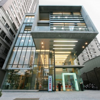
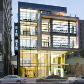
For this project, the designer uses the basic geometric concept of surface and body to construct the spatial formation and the facade structure and to reflect the difference and the urban texture of the base frontage. Through the designers exquisite planning and delicate execution, an inverted L shaped wall surface and a rectangular body carrier are constructed, and the building is wrapped, glued, overhanging, retracted, and folded to demonstrate a multi layered architectural image.
UNIQUE PROPERTIES / PROJECT DESCRIPTION:
Since the left side of this site is adjacent to a tall building. The right side is adjacent to a low-rise building; the designer has purposely created an inverted L shaped wall extending from the left side to the roof to wash away the oppressive feeling brought by the tall building on the left side.
OPERATION / FLOW / INTERACTION:
The designers plan to retreat the building into the base and combine it with the shaded space underneath the concrete box to create an urban open space where one can stay and watch. By installing a large glass curtain, the designer introduces natural light indoors during the daytime, while the interior light source can be mapped out to light up the city at night. Inside, the high ceiling design opens up the lobby space, delivering a spacious look. On the other side, a section of yellow lacquered glass is wrapped around each column to liven up the spatial imagery.
PROJECT DURATION AND LOCATION:
The project was completed in August 2006 in Taichung, Taiwan
FITS BEST INTO CATEGORY:
Architecture, Building and Structure Design
|
PRODUCTION / REALIZATION TECHNOLOGY:
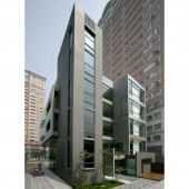
In contrast, the right side of the facade is constructed as a suspended concrete carrier with the image of penetrating large glass to bring out a distinct and unique urban spatial expression. Turning to the right side of the building, one will realize the wall is folded to create a 30 degree angled window design, with each window facing in the direction of a wide field of vision. The folded wall will also avoid direct sunlight, thus achieving excellent lighting and shading.
SPECIFICATIONS / TECHNICAL PROPERTIES:
The project is about 1089 square meters.
TAGS:
Architecture, Design, Education Center, Modern, Style
RESEARCH ABSTRACT:
The whole building is made of fair faced concrete as the main building material, and the simple and clean architectural shape complements the simple and pure texture of the material. The dark gray vertical volume at the right rear of the building is not only the highest point of the building but also the space for vertical movement. The floating concrete box is glued from here and extended horizontally to the front, presenting a visual image of forceful tension.
CHALLENGE:
For the primary space on the project’s north side, the designer adopts a large glass curtain design, which allows much natural light indoors. It reduces the number of light hours during the daytime, thus reducing the use of lighting, extending the life of lighting, lowering electricity consumption, and achieving energy saving and carbon reduction.
ADDED DATE:
2022-09-29 02:06:13
TEAM MEMBERS (1) :
IMAGE CREDITS:
Hsu Jung Tien, 2022
|


