DESIGN NAME: Flycat
PRIMARY FUNCTION: Brand Identity
INSPIRATION: The "F" is strengthened and extracted as the super identification symbol of the brand, and the forward rhythm reflects the enterprising spirit of the enterprise; the overall sense of hierarchy is created, and the brand characteristics are emphasized. The design uses the aesthetic philosophy of "Road to Simplicity" to create clear and powerful symbolic characteristics, present a sense of modern technology, and endow the identification symbols with multiple possibilities and ductility.
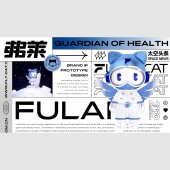
UNIQUE PROPERTIES / PROJECT DESCRIPTION: Flycat is a brand focusing on oral medical technology. It leads the development with innovation, and does not restrict the imagination of the future in the current form. It is hoped that the new brand upgrade can break the stereotype, reconstruct the brand visual system and reshape the brand in a variety of extended forms. vitality.Through the creation of brand IP, the brand image is strengthened and the brand value is conveyed.
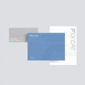
OPERATION / FLOW / INTERACTION: The brand logo uses "F" as the identification symbol and auxiliary element, which can be applied to various forms of applications such as posters, office supplies, and products; the brand IP image is a derivative based on the brand, which can be applied to the communication and application of different media, and can be used for Multi-field, multi-dimensional and multi-form creative extension enhances the core competitiveness of the brand.
PROJECT DURATION AND LOCATION: The project started in July 2021 in Shenzhen and finished in January 2022 in Shenzhen.
FITS BEST INTO CATEGORY: Graphics, Illustration and Visual Communication Design
|
PRODUCTION / REALIZATION TECHNOLOGY: Simple, clear and powerful logos can bring good memory points and facilitate communication. The brand IP image uses gradient metal shell and transparent material to enhance the sense of modern technology.
SPECIFICATIONS / TECHNICAL PROPERTIES: The actual production size of the brand LOGO is the minimum width of 5cm x height of 0.6cm, and the specifications are set in equal proportions in specific materials, which is convenient for customers to use and extend to actual production.
TAGS: Brand Design, Logo Design, Vi Design, Medical Technology, Brand Ip Design
RESEARCH ABSTRACT: With the changing trend of the Internet era, dental medical technology brands need to establish a highly topical and friendly IP image. As a communication medium between the brand and consumer groups, it can carry various forms of changes and continue to output content for the brand. Endow the product with social attributes and brand exclusivity at the same time.
CHALLENGE: The brand logo creates a sense of hierarchy and individuality, and creates brand differentiation. After repeated scrutiny and attempts, it has a more modern aesthetic in temperament. The brand IP carrier that extends from the brand name, the cat, how to combine the technological elements to become the unique spokesperson of the brand, and establishing the exclusive DNA of the brand is a difficult problem.
ADDED DATE: 2022-08-19 03:36:56
TEAM MEMBERS (1) :
IMAGE CREDITS: Image #1-#5:
Designer,Wei Sun,2021
Designer,Mingran Wu,2021
3D modeling renderer,Jiaying Zheng,2021
PATENTS/COPYRIGHTS: All copyrights DOTONE Brand Design,2021
|