DESIGN NAME:
Scaling Inc
PRIMARY FUNCTION:
Brand Identity
INSPIRATION:
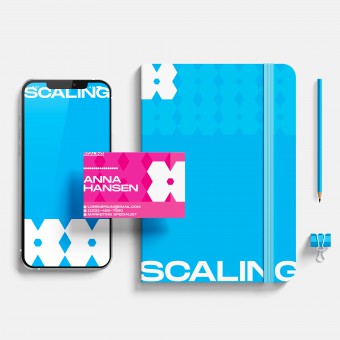
The overall design focuses on identifying and emphasizing the meaning of scaling at Scaling Inc. Scaling represents efficiency, adaptability, fast growth, and novelty. The logo design is a single matrix lattice composed of five hexagons. The central hexagon represents the company itself standing out and getting highlighted. Moreover, the choice of non-regular hexagon shape is to make the lattice into a gear-like bee form which both emphasizes the values of Scaling Inc and its goal to create benefits for everyone within the network.
UNIQUE PROPERTIES / PROJECT DESCRIPTION:
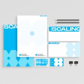
Scaling Inc is a cutting-edge media company that utilizes scalable technologies and novel tools to generate advertisements and marketing campaigns. The logo design is composed of polygon-shaped lattices. In this case, the campaign for Scaling includes stationery set design, poster design, and other accessory designs. The design of gear-feeling matrix lattices with a hexagon dot in the middle illustrates that SCALING is a team player that values the benefits of all members within its network and provides win-win opportunities to its clients.
OPERATION / FLOW / INTERACTION:
In the media company field, creating a good campaign must understand who the audience is and what the audience wants. Based on focus group interviews and large-scale surveys, vivid colors and unique patterns could attain more attention from target users and portray the characteristics of the company. The overall design offers the audience a sense of simple, straightforward, avant-garde, and futuristic connection to the brand, representing the Scaling and its products.
PROJECT DURATION AND LOCATION:
The project starts on June 1st, 2022, in the United States of America
FITS BEST INTO CATEGORY:
Graphics, Illustration and Visual Communication Design
|
PRODUCTION / REALIZATION TECHNOLOGY:
Photoshop, Illustration, and Digital Design
SPECIFICATIONS / TECHNICAL PROPERTIES:
The Scaling logo was created by using Adobe Illustrator and Photoshop. The design is adapted in web and print ads, such as stationery sets, posters, wallpaper, bags, etc. They can efficiently make online and offline campaigns with their unique and vivid design.
TAGS:
Branding, Campaign, Modern, Geometric, Logo, Packaging, Visual Identity, Graphic Design
RESEARCH ABSTRACT:
The research is conducted around the study of the Scaling Inc case. The objective is to design the logo that helps build brand identity and recognition. The research methodology is based on a combination of waterfall and agile styles. The combined methods enabled me to gradually accomplish the objective by repeating the waterfall model on each more minor phase of the agile model. With the information given about the Scaling Inc case, the design was revised like software updates to match the need of Scaling Inc better and eventually perfect itself. Further data collection was conducted through focus group interviews and large-scale surveys with participants of target audiences and company affiliates. The result indicated that simple graphics like polygons and futuristic icons that relate to technology were most popular. Based on the research results, the design was finalized and received positive feedback, mainly about how the logo reflects the company objective and helps attract target clients.
CHALLENGE:
Scaling wants to reflect its characteristics and objectives through graphics. The challenge is how to send the correct message effectively. First, the logo itself demonstrates the four cornerstone values of Scaling. Then the choice of gear-like bee shape and the digital network/hive, made by repetitions of logo and shown on accessories, convey the idea of Scaling playing a key role within the network and brings solid services/products to its customers just like bees in a hive and gears in a machine.
ADDED DATE:
2022-08-11 13:16:17
TEAM MEMBERS (1) :
IMAGE CREDITS:
Yanming Chen
|


