Italian Capital of Culture Logo And Launch Campaign by Akomi |
Home > Winners > #143502 |
 |
|
||||
| DESIGN DETAILS | |||||
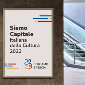
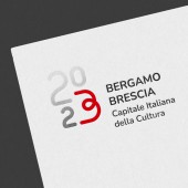
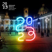
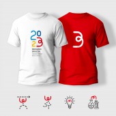
| DESIGN NAME: Italian Capital of Culture PRIMARY FUNCTION: Logo And Launch Campaign INSPIRATION: The whole geometric construction is based on the curvature of linear elements of constant thickness, inspired by the building rods (strong and resilient, they bend but they do not break, as Bergamo and Brescia did during the very first Covid wave) for which the cities are well known. The objective was to overcome the stereotypes of industrial cities and prove that Bergamo and Brescia have a lot to say when it comes to culture. UNIQUE PROPERTIES / PROJECT DESCRIPTION: The logo has been chosen by the Municipalities of Bergamo and Brescia to represent the two cities, that together will become Italian Capital of Culture in the year 2023. The design idea is based on the identification of a simple and linear element, whose versatility allows it to acquire different meanings and to complete different shapes from time to time. The logo is designed to evolve in time and being used even when 2023 year will be over. OPERATION / FLOW / INTERACTION: The logo has been launched in december 2021 and it will be used in its release versione until the end of 2023. The evolved version of the logo will to be adopted from the end of year 2023 as a legacy for future cultural events. The most recognizable sign of the logo (the red 3/B element) is designed to survive after year 2023 will be over and to be completed with different shapes in different contexts. It's a versatile and anthropomorphic sign that generates empathy and can play different roles. PROJECT DURATION AND LOCATION: The logo has been launched in december 2021 and it will be used in its release versione until the end of 2023. The evolved version of the logo will to be adopted from the end of year 2023 as a legacy for future cultural events. FITS BEST INTO CATEGORY: Graphics, Illustration and Visual Communication Design |
PRODUCTION / REALIZATION TECHNOLOGY: Thanks to its design the logo can be embossed, perforated, cut, embroided and obviously printed with any tecnique on any kind of support, as it's required to a mass event logo with a very wide spreading. There are no physical or digital limits to its coherent reproduction and recognizability, from black and white printing to digital video animation. SPECIFICATIONS / TECHNICAL PROPERTIES: Minimum height of the logo: 10 mm TAGS: graphics, branding, logo design, advertising, cultural projects, Italian capital of culture, events, Brescia, Bergamo RESEARCH ABSTRACT: As two different cities were about to become together a jointed Italian Capital of Culture, the first choice has been to avoid any cultural symbol of one of the two cities. Only the colors are inspired by the two municipal coats of arms: blue and red for Brescia, yellow and red for Bergamo. The design team has been looking for some kind of "pop" logo, taking inspiration from big international sport events, as we believe that Culture has to overcome any barrier and become everyone's patrimony. CHALLENGE: The hardest challenge was to design a logo in which both Bergamo and Brescia could identify themselves, as they are two cities very similar to each other but also known for their rivality. A public call was open from the two Municipalities to all the professionals, who have been asked to produce a huge amount of work in a short time. The logo has been chosen from more than 50 proposals by the jury chaired by Antonio Romano (Inarea), one of the most appreciated professional in visual identity. ADDED DATE: 2022-07-29 16:13:13 TEAM MEMBERS (1) : IMAGE CREDITS: Akomi, 2022. |
||||
| Visit the following page to learn more: http://tinyurl.com/4ta9a9r9 | |||||
| AWARD DETAILS | |
 |
Italian Capital of Culture Logo and Launch Campaign by Akomi is Winner in Graphics, Illustration and Visual Communication Design Category, 2022 - 2023.· Read the interview with designer Akomi for design Italian Capital of Culture here.· Press Members: Login or Register to request an exclusive interview with Akomi. · Click here to register inorder to view the profile and other works by Akomi. |
| SOCIAL |
| + Add to Likes / Favorites | Send to My Email | Comment | Testimonials | View Press-Release | Press Kit | Translations |
Did you like Akomi's Graphic Design?
You will most likely enjoy other award winning graphic design as well.
Click here to view more Award Winning Graphic Design.


