DESIGN NAME:
Mohanii
PRIMARY FUNCTION:
Brand Identity
INSPIRATION:
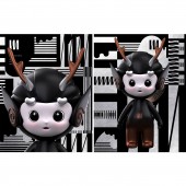
Drawing inspiration from Chinese ink and wash, we designed a brand symbol with vitality and "sportiness" for the brand, which can be broken up, reconstructed and integrated with abstract oriental elements. The design is based on plane composition, postmodern abstraction as the form of expression, based on fashionable geometric shapes, integrates oriental culture to interpret black and white classics, and finally forms a visual image with avant-garde artistry and commercial recognition.
UNIQUE PROPERTIES / PROJECT DESCRIPTION:
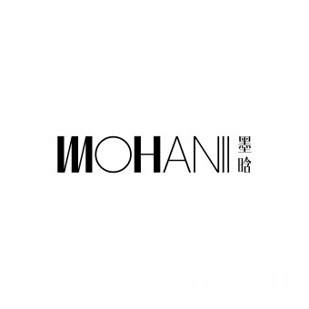
The Mohanii logo is dominated by English, reflecting the international simplicity and tonality; it is simplified and linked through the image of Chinese calligraphy, and the M is innovatively used as the core identification symbol and integrated into the oriental humanistic spirit.
MOHANII combines and reinterprets serifs and isolines. Symbols strengthen M and H, and weaken other characters to form visual layers, so that they form a unified image energy field.
OPERATION / FLOW / INTERACTION:
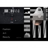
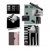
Through the personalized use of brand logos in different media, consumers can bring different fresh visual experiences and perceive the unique texture and extended vitality of brand logos. For consumers, consumption is also an appreciation of aesthetic life. This kind of consumption behavior based on aesthetics will increase people's attention to traditional culture and generate continuous links.
PROJECT DURATION AND LOCATION:
The project started in Shenzhen in December 2020 and completed in Shenzhen in July 2021.
FITS BEST INTO CATEGORY:
Graphics, Illustration and Visual Communication Design
|
PRODUCTION / REALIZATION TECHNOLOGY:
M corresponds to ink, which is the core identification element of the brand and the spiritual carrier of the brand. The design uses the humanistic core as the strength to superimpose the brand height, has a unique texture and extended vitality, and implants cultural genes into the brand identity. It can be repeated, broken up, composed and integrated into abstract oriental elements, and can be applied to any medium.
SPECIFICATIONS / TECHNICAL PROPERTIES:
The size of the brand logo is not uniformly stipulated, and the size can be set by itself according to the actual production.
TAGS:
Brand Design, Logo Design, Brand Identity, Fashion Branding, Geometric Art
RESEARCH ABSTRACT:
Mohanii is a fashion pioneer brand positioning the core of the oriental spirit. Based on the vision of "high-end experimentation";, Mohanii is committed to building a brand in multiple dimensions such as culture, art, business, and fashion trends. With the brand tenet of "continuously providing consumers with fresh experiences through visual innovation", it actively explores the possibilities between aesthetics and commerce. Therefore, it is necessary to establish a new fashion brand identity that is unique and has avant-garde artistry.
CHALLENGE:
There are two challenges to face. One is how to creatively excavate a unique brand visual language in an international style, penetrate and implant the brand cultural genes, and establish a differentiated, exclusive and recognizable industry identity for the brand. The second is how to build a bridge of communication between brands and users, and convey the cultural connotation behind fashion products, so as to give the realization of brand value as a fulcrum.
ADDED DATE:
2022-06-30 12:29:29
TEAM MEMBERS (1) :
IMAGE CREDITS:
Image #1-#5
Designer,Wei Sun,2020
Designer,Mingran Wu,2020
PATENTS/COPYRIGHTS:
All copyrights DOTONE Brand Design,2020
|
