DESIGN NAME:
Cidih
PRIMARY FUNCTION:
Brand Identity
INSPIRATION:
There are positive and negative shapes between different letters, and there is contingency. I have been wondering whether I can create a font that can express two letters through positive and negative shapes, and how to make this contingency more meaningful in the design. In general brand identity projects, complex design may affect the identifiability, but I want to know whether positive and negative shapes can be used to match the brand tone. These ideas became the inspiration of this design.
UNIQUE PROPERTIES / PROJECT DESCRIPTION:
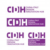
CIDIH is an educational and scientific research base jointly built by Tsinghua University and Politecnico di Milano in Milan, Italy, on the afternoon of February 22, 2017, witnessed by Chinese President Xi Jinping and Italian President Sergio Mattarella. They needed a brand identity that was inclusive and international, so we designed the positive and negative shapes to reflect the founding purpose of CIDIH. They have used this brand identity throughout their space, website and products.
OPERATION / FLOW / INTERACTION:
A user who comes into contact with cidih for the first time cannot immediately understand the service purpose of the institution. He needs to have a good first impression. Through contact with the brand logo, the user can gradually penetrate the brand concept of the institution in his mind, so as to facilitate a more smooth understanding of the institution in the future.
PROJECT DURATION AND LOCATION:
The project was started in November, 2020 and put into operation in May, 2021.
FITS BEST INTO CATEGORY:
Graphics, Illustration and Visual Communication Design
|
PRODUCTION / REALIZATION TECHNOLOGY:
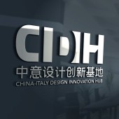
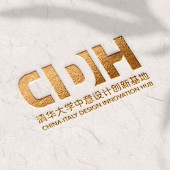
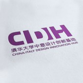
C and D are positive and negative to each other, symbolizing the harmonious unity of theory and practice, as well as the inclusiveness of cidih as an international platform. The semicircle in the middle symbolizes the rising sun and the ignition and transmission of the fire of design innovation. H symbolizes hub. The negative shape of H is the silhouette of cidih, which reflects the connection of international design innovation resources with cidih as the center.
SPECIFICATIONS / TECHNICAL PROPERTIES:
This special positive and negative font design has been applied to all contents of the organization. It is also displayed in a variety of ways, from printed materials to digital signage, websites, screens, cut sheets and acrylic.
TAGS:
Brand Identity, Logo, VI
RESEARCH ABSTRACT:
Through the research on the design of letter positive and negative shapes, I found a new design language, which turns the contingency of letter positive and negative shapes into necessity and rationalizes it. This method can help more brands to explain the brand concept, and even reduce the waste of ink in printers.
CHALLENGE:
CIDIH is a comprehensive organization. The content of its brand concept is both broad and abstract. How to express these concepts in the design has become the biggest difficulty of this project. We solved this problem through the design of positive and negative letters.
ADDED DATE:
2022-06-23 06:55:31
TEAM MEMBERS (1) :
Peng Wang
IMAGE CREDITS:
Peng Wang, 2022.
|


