|
|
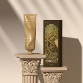
Givenery Garden Hand Cream Packaging by Huizi Tian |
|
|


|
|
| DESIGN DETAILS |
DESIGN NAME:
Givenery Garden
PRIMARY FUNCTION:
Hand Cream Packaging
INSPIRATION:
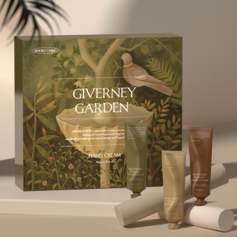
The three essential oils of the product are extracted from a variety of mysterious plants. Therefore, the illustration design integrates a large number of plant elements such as rose, Daisy, bamboo and cypress, windbreak, etc., giving people a natural and pure product impression; And choose an elegant serif font. The dark colors of the text and the whole picture set off the French mysterious atmosphere, mobilize the sense of smell, and deepen the visual tone of aromatherapy products.
UNIQUE PROPERTIES / PROJECT DESCRIPTION:
Her work, created in 2021, is the packaging design of a hand cream. The product is mainly made up of three hand creams with different effects and tastes. Users are targeted at women aged 25-35 who have certain purchasing power.
OPERATION / FLOW / INTERACTION:
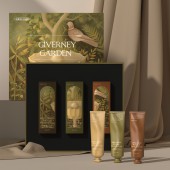
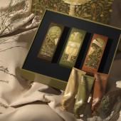
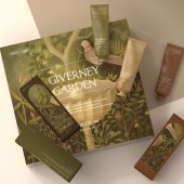
The work consists of a gift box, three separately packed boxes and three aluminum cans. In terms of packaging structure, from a female perspective, it conveys the visual feeling of beauty to consumers and adds a sense of ceremony to the products.
PROJECT DURATION AND LOCATION:
The project was launched in Hangzhou, China in November 2021 and completed in January 2022.
FITS BEST INTO CATEGORY:
Packaging Design
|
PRODUCTION / REALIZATION TECHNOLOGY:
The design of the gift box selects the heaven and earth cover box type, which adds a sense of ceremony to the opening method and highlights the quality; White card printing and touch paint are used to further deepen the texture on the basis of ensuring the color of illustration. The small box uses the bronzing process to increase the design texture. The product body is made of aluminum tube and printed in spot color to better ensure the ink quality and color difference.
SPECIFICATIONS / TECHNICAL PROPERTIES:
Giftbox:width276mmxdepth245mmxheight54mm
. Simple box:width44.25mmxdepth130mmxheight53mm.
TAGS:
Packaging design, Handcream, Graphic design, Aromatherapy, Illustration
RESEARCH ABSTRACT:
In recent years, Chinese cosmetics and aromatherapy brands have gradually risen, and high-quality packaging designs have emerged in endlessly. As a beauty brand, SHERO Ching has high requirements for the visual presentation of products. This work takes illustration as the main design object to convey elegant and natural visual impression to consumers.
CHALLENGE:
In the process of illustration design, the color of the whole picture has been adjusted for many times. For a time, I was entangled in color control. I tried bright colors and dark colors respectively, and finally chose the dark color version, which is more deep and quiet, in line with the product tone.
ADDED DATE:
2022-06-14 02:25:21
TEAM MEMBERS (1) :
IMAGE CREDITS:
Huizi Tian, 2022.
|
|
| CLIENT/STUDIO/BRAND DETAILS |
 |
NAME:
Shero Ching
PROFILE:
Shero Ching is a female beauty brand founded in Hangzhou, China, this story started in 2014. Good practicality is always the foundation of Shero Ching, those average level products are always unacceptable in this brand, and the slogan shows its brand concept "born for beauty, born for need". Shero Ching resists any uncomfort user experience made by its own products, they advocate the enjoyment of the nature and a better female lifestyle, so that they built an international research and development team, building collaboration with reliable local factories and selecting superior raw material from the nature all over the world. Shero Ching's primary product is female skincare, meanwhile it also has other products such as makeup, body care and healthy food. In the past few years, Shero Ching carefully listened to opinions from customers, its product quality had maintained at high level at all times. Shero Ching pays more attention to its overall visual impression and user experience, aiming to leave a high level image for clients. Furthermore, Shero Ching puts creativity and originality on a top priority in their design, in order to become more specialized and differentiated on domestic market, also the international market in the near future. At present Shero Ching is still working on perfecting its own products for client's beauty demand and devoting itself into practical aesthetics, they want to be a ultimate aesthetician, a rigorous experimenter, a guardian of young girls’ path to beauty. Thus, consistently, Shero Ching will keep committing
to provide customers with excellent products and services.
|
|
|
| COMMENTS |
| Qiuyu Li |
Comment #95429 on June 7, 2023, 11:33 am |
|
The perfect fusion of classical and modernist styles, with the overall design incorporating a subdued gray color palette, evokes a sense of gentle elegance. This design approach fills the space with charm and exudes a warm and comfortable atmosphere, reminiscent of the beauty of the Garden of Eden. It possesses both tremendous allure and an air of mystery.
|
|
|
Did you like Huizi Tian's Packaging Design?
You will most likely enjoy other award winning packaging design as well.
Click here to view more Award Winning Packaging Design.
Did you like Givenery Garden Hand Cream Packaging? Help us create a global awareness for good packaging design worldwide. Show your support for Huizi Tian, the creator of great packaging design by gifting them a nomination ticket so that we could promote more of their great packaging design works.
|
|

|
|
|
|


