DESIGN NAME:
Anlan Branding
PRIMARY FUNCTION:
Brand Identity
INSPIRATION:
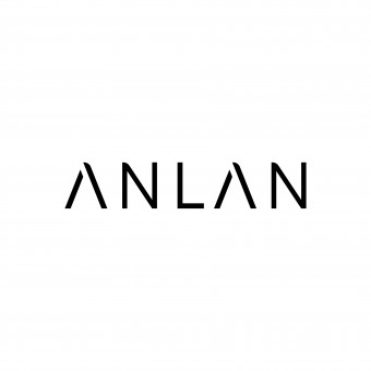
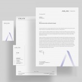
In this new identity, we find the letter A can be a stable but also gentle symbol. The just right cut in letter A reveals brand value: technology and aesthetics are more perfectly matched, creating more possibilities and experiences for clients. It matches user's understanding and feeling of the new look of ANLAN.
UNIQUE PROPERTIES / PROJECT DESCRIPTION:
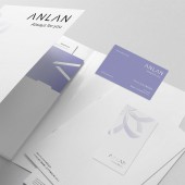
The design reshapes ANLAN identity as a beauty brand, ensuring its recognizability in different scenarios. To convey the concept of a modern femininity of rigidity and softness, the typeface corners are carefully rounded but overall kept simple and clean. A flower pattern irratived from letter A blooms a new gesture to interpret the meaning of beauty. Purple color as branding main color is brave and bright. We hope new identities change the inherent perception of women beauty brand and lead to a more independent feeling.
OPERATION / FLOW / INTERACTION:
The new identity shows the charm of modern beauty, and the inclusive design is easier to apply, helping brand to convey their attitude. It has proven to make the brand simple, clear and straightforward, and users can easily associate the visual identity with the products offered, identify it and use it.
PROJECT DURATION AND LOCATION:
The project began in Shenzhen, China in April 2021 and was delivered to the client in January 2022.
FITS BEST INTO CATEGORY:
Graphics, Illustration and Visual Communication Design
|
PRODUCTION / REALIZATION TECHNOLOGY:
In order to make the brand to convey the aesthetics while showing sufficient modern independence “feeling”, we deliberately downplayed the importance of symbolic flower pattern and decided to remove the colors in the logo. We balanced the tension between "rigidity/ttechnology" and "softness/feminine".
SPECIFICATIONS / TECHNICAL PROPERTIES:
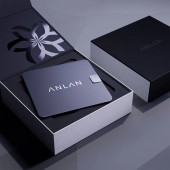
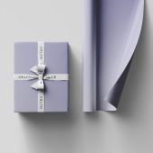
The coordinated images were applied to all physical stationery system and package system.
TAGS:
Brand Identity, Branding, Visual Identity, Logo, Typeface, Experience
RESEARCH ABSTRACT:
In Japan, the beauty brands were always designed in a gentle, feminine language. Curved shapes, pink or champagne visual colors flooding the market. As an emerging beauty brand, ANLAN needs to break through the inherent market atmosphere and bring new feelings to modern consumers.
CHALLENGE:
In the process of designing, challenge is looking for the right portion between gentleness and strength. We want to convey the message that enjoying the use of these beauty devices to renew youself and show charmy confidence. We verified the degree of rounded corners of the logotype, the portion of red and blue in the sensitive purple main color, and the ratio of graphics and text, all of which must be in line with the feeling of combining rigidity and softness. Managing this sense is also a challenge, for which we have designed guidelines and various application formats so that customers can do it themselves.
ADDED DATE:
2022-06-10 03:56:52
TEAM MEMBERS (5) :
Designer: Haiwen YANG, Designer: Jiang Liang Li, Designer: Meng Yao Yu, Designer: Wei Wei Chen and Designer: Zi Xun Meng
IMAGE CREDITS:
Shenzhen Baselab Technology Ltd.
PATENTS/COPYRIGHTS:
Shenzhen Baselab Technology Ltd.
|


