Designthinkers Conference Materials by Liying Wang |
Home > Winners > #141209 |
 |
|
||||
| DESIGN DETAILS | |||||
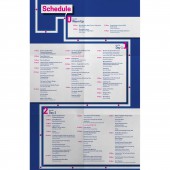
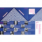
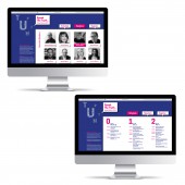
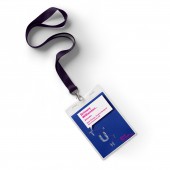
| DESIGN NAME: Designthinkers PRIMARY FUNCTION: Conference Materials INSPIRATION: Design is like a maze, with unpredictable twists and turns, where each decision can make or break a project. To capture this, I created a visual representation of the design process as a maze, symbolizing the confusion and challenges designers face, with every decision leading to a different outcome. It encourages pushing boundaries and finding innovative solutions while celebrating the creative process and its rewarding challenges. The design guides us through the maze, highlighting the endless possibilities that come with our work. UNIQUE PROPERTIES / PROJECT DESCRIPTION: Design the conference materials for an existing conference. Create a sophisticated visual concept that matches the feel of the theme of the year. The goal is to demonstrate the ability to integrate conceptual ideas and visual design skills. OPERATION / FLOW / INTERACTION: Various deliverables were developed for the conference, including a promotion poster, program, website, application, name badge, and conference signage. PROJECT DURATION AND LOCATION: The project started in September 2018 and finished in December 2018 in San Francisco. FITS BEST INTO CATEGORY: Graphics, Illustration and Visual Communication Design |
PRODUCTION / REALIZATION TECHNOLOGY: Adobe Photoshop, Adobe Illustrator, Adobe InDesign SPECIFICATIONS / TECHNICAL PROPERTIES: Poster: 18 in x 24 in, Program: 13 in x 19 in TAGS: Conference Materials, Visual Communication, Poster, Program, Website, conference signage RESEARCH ABSTRACT: Designthinkers is an annual conference with a mission to gather diverse perspectives to explore the process of design and creativity. The theme for 2018 is Speak The Truth. The whole design process is like an unknown journey, like a maze. We don't know what will happen at the next intersection. Designers like those little magenta dots, going on the road of our own choice. CHALLENGE: How can creating a novel visual system for the conference cater to the needs and interests of the majority of attendees, while simultaneously aiding the organization in increasing attendance and achieving its mission of enhancing awareness of visual communication? Additionally, how can the process of design and creativity be visually depicted to evoke comparable emotions and responses from the intended audience? I keep asking myself those questions and thinking about what symbol or element can build connections and evoke the audience's similar feelings. ADDED DATE: 2022-04-29 00:50:42 TEAM MEMBERS (1) : IMAGE CREDITS: Image #1: Creator Liying Wang Image #2: Creator Liying Wang Image #3: Creator Liying Wang Image #4: Creator Liying Wang Image #5: Creator Liying Wang |
||||
| Visit the following page to learn more: https://liyingwangdesign.com/project6 | |||||
| AWARD DETAILS | |
 |
Designthinkers Conference Materials by Liying Wang is Winner in Graphics, Illustration and Visual Communication Design Category, 2022 - 2023.· Read the interview with designer Liying Wang for design Designthinkers here.· Press Members: Login or Register to request an exclusive interview with Liying Wang. · Click here to register inorder to view the profile and other works by Liying Wang. |
| SOCIAL |
| + Add to Likes / Favorites | Send to My Email | Comment | Testimonials | View Press-Release | Press Kit | Translations |
| COMMENTS | ||||||||||||||||||||
|
||||||||||||||||||||
Did you like Liying Wang's Graphic Design?
You will most likely enjoy other award winning graphic design as well.
Click here to view more Award Winning Graphic Design.


