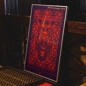
Ronin Silkscreen Print by Dmitry Kudinov |
Home > Winners > #140601 |
 |
|
||||
| DESIGN DETAILS | |||||
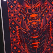
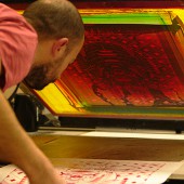
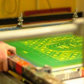
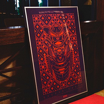
| DESIGN NAME: Ronin PRIMARY FUNCTION: Silkscreen Print INSPIRATION: Deeper Roots Stronger Branches - author's slogan, life credo, which reflects the approach to the creative path as a whole. The realization of any task requires immersion in a previously unknown field of activity and a deeper immersion in the subject creates more opportunities for development. UNIQUE PROPERTIES / PROJECT DESCRIPTION: The character Ronin appeared as a reflection of the author's personal qualities, in translation ronin means a man without a master. The philosophy of self-development is a key factor in the development of personality and professional qualities through accumulated experience. In this understanding, professional activities are not separated from everyday activities, the key qualities of a person as a personality are reflected in any direction of activity, which form the fundamental values as a kind of foundation. OPERATION / FLOW / INTERACTION: The image of the character was inspired by samurai culture, in particular the samurai outlaw ronin. The character is formidable and even intimidating, in the animated version it emerges from a dark background, starting with the eyes, this is for a reason, because the mask always serves as a screen to hide the emotions of the person behind it. The armor, mask, and helmet, in addition to their protective functions, serve as a deterrent and speak of belonging to a certain clan or caste. This is why the samurai ronin wore black armor without any identifying marks, which only emphasized their lack of affiliation with any master. PROJECT DURATION AND LOCATION: The project began in 2014, the illustration created was implemented in a limited-edition print format in collaboration with Screen Print Studio. The whole realization process took about a month of work, every detail was important, from the choice of paper to the final print quality. The realization of the prints took place at the Crystal Cluster in Moscow. FITS BEST INTO CATEGORY: Graphics, Illustration and Visual Communication Design |
PRODUCTION / REALIZATION TECHNOLOGY: Silkscreen printing with tinted lacquer on paper (270 g), framed SPECIFICATIONS / TECHNICAL PROPERTIES: 500 x 700 mm, limited edition 14 copies, hand-numbered and signed TAGS: silkscreen, print, illustration, branding, ronin, mascot, character, graphic, design RESEARCH ABSTRACT: The study was based on several parameters, such as motivational factors, personal factors, and qualitative indicators of professional performance. The combination of these factors determined the framework for the formation of an image that would be able to combine a set of personal and professional qualities. The criteria identified were: responsibility, dedication, involvement, selflessness, creativity, respect for personal and other people's time. Based on these criteria the metaphor "deeper roots - stronger branches" was formed, which succinctly reflects the mechanics of perception of the world around us. CHALLENGE: Ronin is an immersion in the author's inner world, introspection, the perception of personality in the coordinates of world values. A kind of mental self-portrait. The process of internal knowledge is complex and even painful, in which it is necessary to look at the personality from the outside, through the prism of the features of the character, how these features affect the result of professional activity. ADDED DATE: 2022-03-31 10:00:16 TEAM MEMBERS (3) : Illustrator: Dmitry Kudinov, Producer: Lidiia Averina and Production: Print Screen Studio IMAGE CREDITS: Image #1: Photographer Rafael RAF, Ronin In MIO #1, 2021. Image #2: Photographer Rafael RAF, Ronin In MIO #2, 2021. Image #3: Photographer Rafael RAF, Ronin In MIO #3, 2021. Image #4: Photographer Vanya Volkov, Ronin WIP #1, 2021. Image #5: Photographer Vanya Volkov, Ronin WIP #2, 2021. Video Credits: Operator & Production Vanya Volkov, Scene Screen Print Studio with Andrey Pronin in cast. PATENTS/COPYRIGHTS: Copyrights belong to Dmitry Kudinov, Vanya Volkov & Rafael RAF |
||||
| Visit the following page to learn more: https://bit.ly/3NEmmUU | |||||
| AWARD DETAILS | |
 |
Ronin Silkscreen Print by Dmitry Kudinov is Winner in Graphics, Illustration and Visual Communication Design Category, 2021 - 2022.· Read the interview with designer Dmitry Kudinov for design Ronin here.· Press Members: Login or Register to request an exclusive interview with Dmitry Kudinov. · Click here to register inorder to view the profile and other works by Dmitry Kudinov. |
| SOCIAL |
| + Add to Likes / Favorites | Send to My Email | Comment | Testimonials | View Press-Release | Press Kit |
| COMMENTS | ||||||||||||||||
|
||||||||||||||||
Did you like Dmitry Kudinov's Graphic Design?
You will most likely enjoy other award winning graphic design as well.
Click here to view more Award Winning Graphic Design.


